



foodtrace
web & mobile app · 2015
role: ui designer · client: foodtrace · process: design-thinking approach
As the locally-sourced food movement grows, suppliers of local produce and the businesses that buy their products need an easy way to find each other. FoodTrace is a Chicago-based startup that provides networking services to area farmers, grocers, and artisans. FoodTrace also allows for members to create shareable maps that display all of their business connections, which is a valuable tool as traceability becomes more important in the food industry. I worked with FoodTrace to redesign their web and mobile app.
FoodTrace presented me with an opportunity to design for a new type of user: business owners. My previous design experience involved consumer-facing projects, but FoodTrace had stressed the importance of maintaining a ‘b2b’ feel in their app. This required that I keep in mind the different motivations and goals that business owners have that differ from typical consumers.
tasks
competitive analysis · style tiles
style guide · ui kit
responsive mockups
competitive analysis
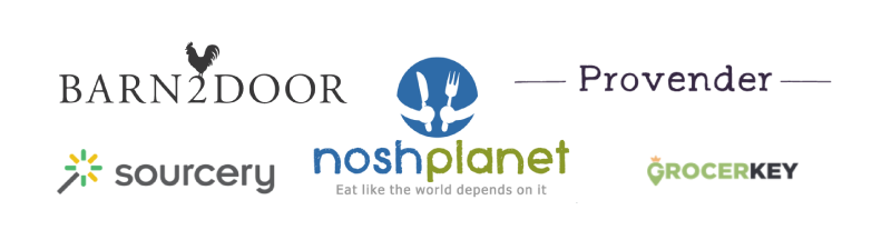
I researched some of FoodTrace’s competitors and inspirations to find ui patterns and opportunities.
takeaways
- Color schemes are typically bright and simple, with only two to three accent colors at most
- Most sites used sans-serif fonts for headers and body text
- Bright, vivid photography was featured prominently through all sites
finding a style
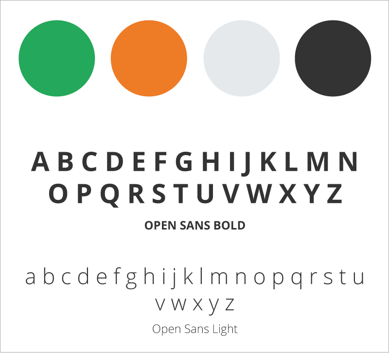
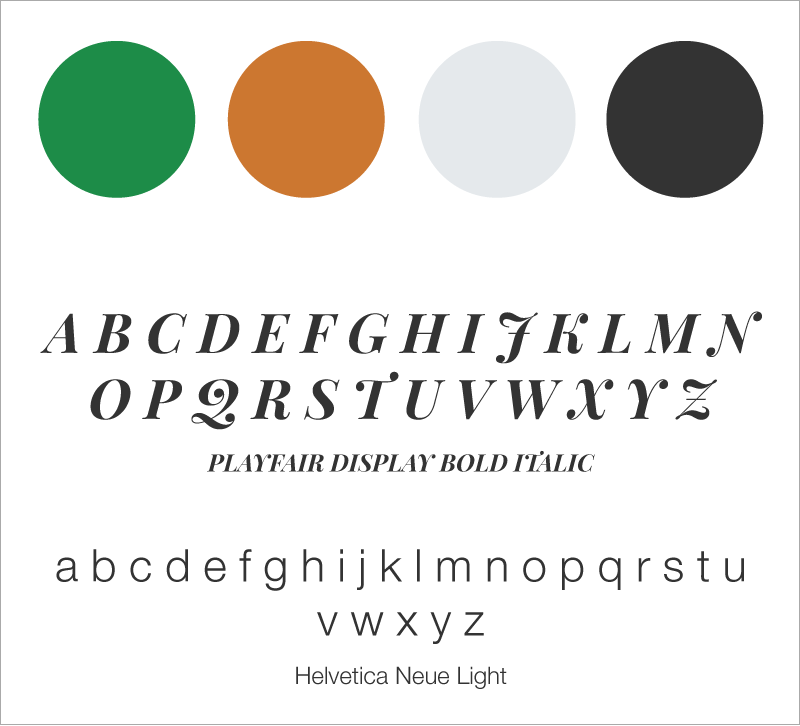
FoodTrace wanted to emphasize a ‘farmer’s market feel’ that simultaneously reflected the b2b nature of the platform. They did not want a brand overhaul, but they were open to suggestions for stylistic changes. I created two different style directions for FoodTrace to consider, leaving the original color scheme largely unchanged.
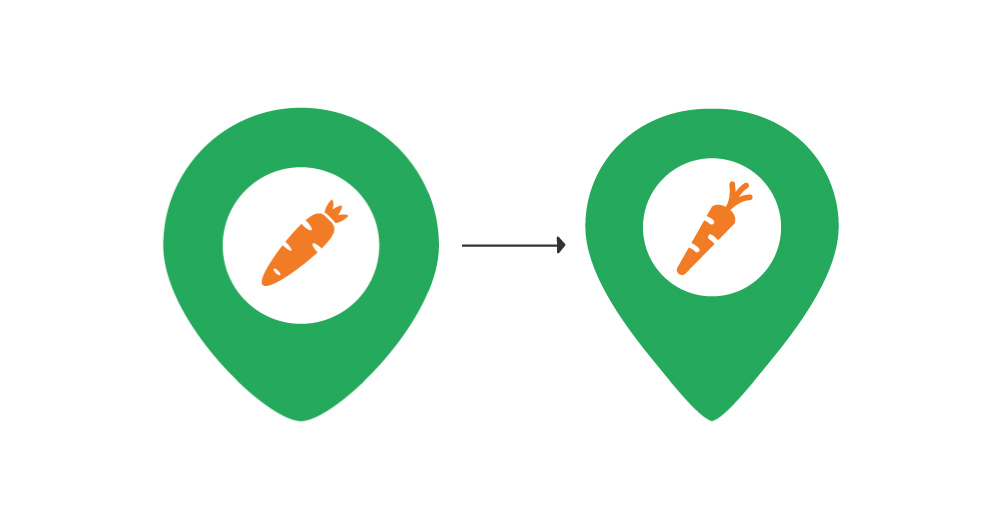
I also made changes to the FoodTrace logo, bringing in the sides to make it a more recognizable map pin and altering the shape of the carrot.
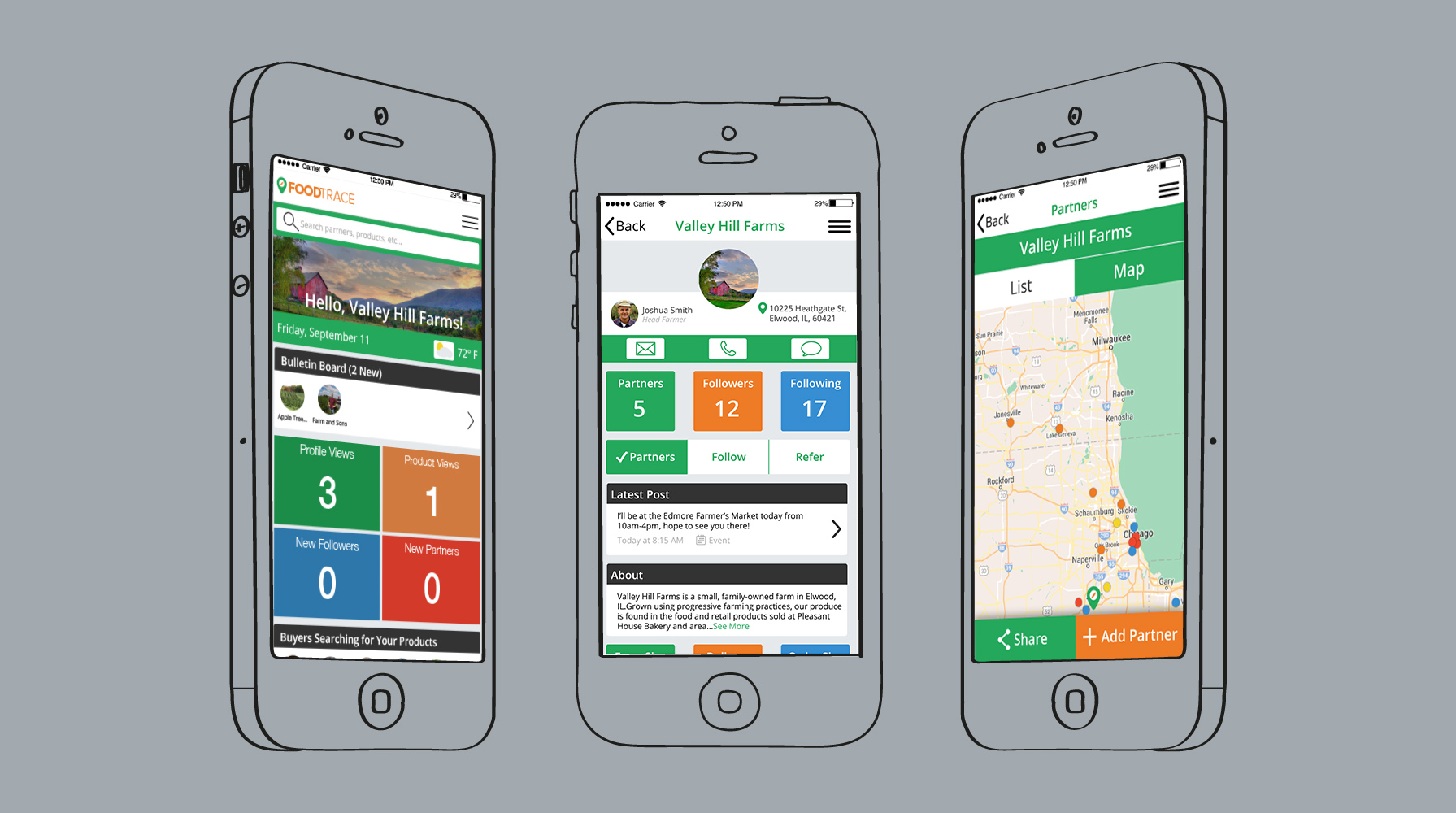
I used mobile wireframes from previously-conducted ux research to create mockups to test out both styles.
Style 1
Style 2
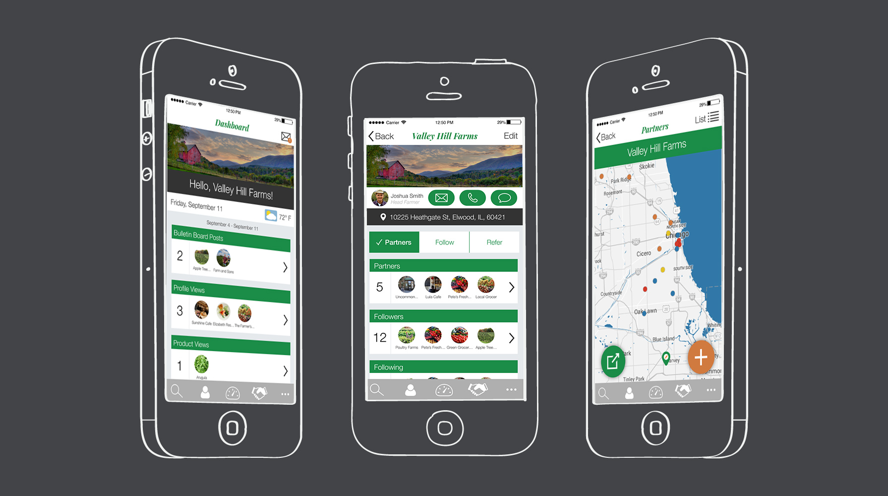
After receiving feedback on the various screens I had built, I chose to flesh out the more formal, professional look for FoodTrace.
final style choices
mockups
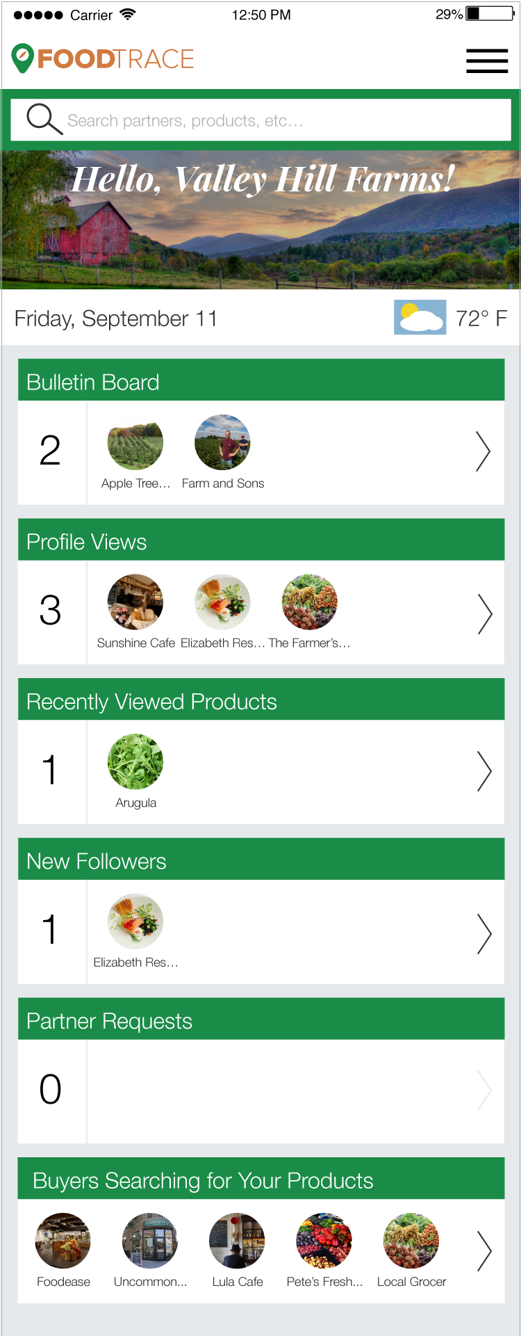
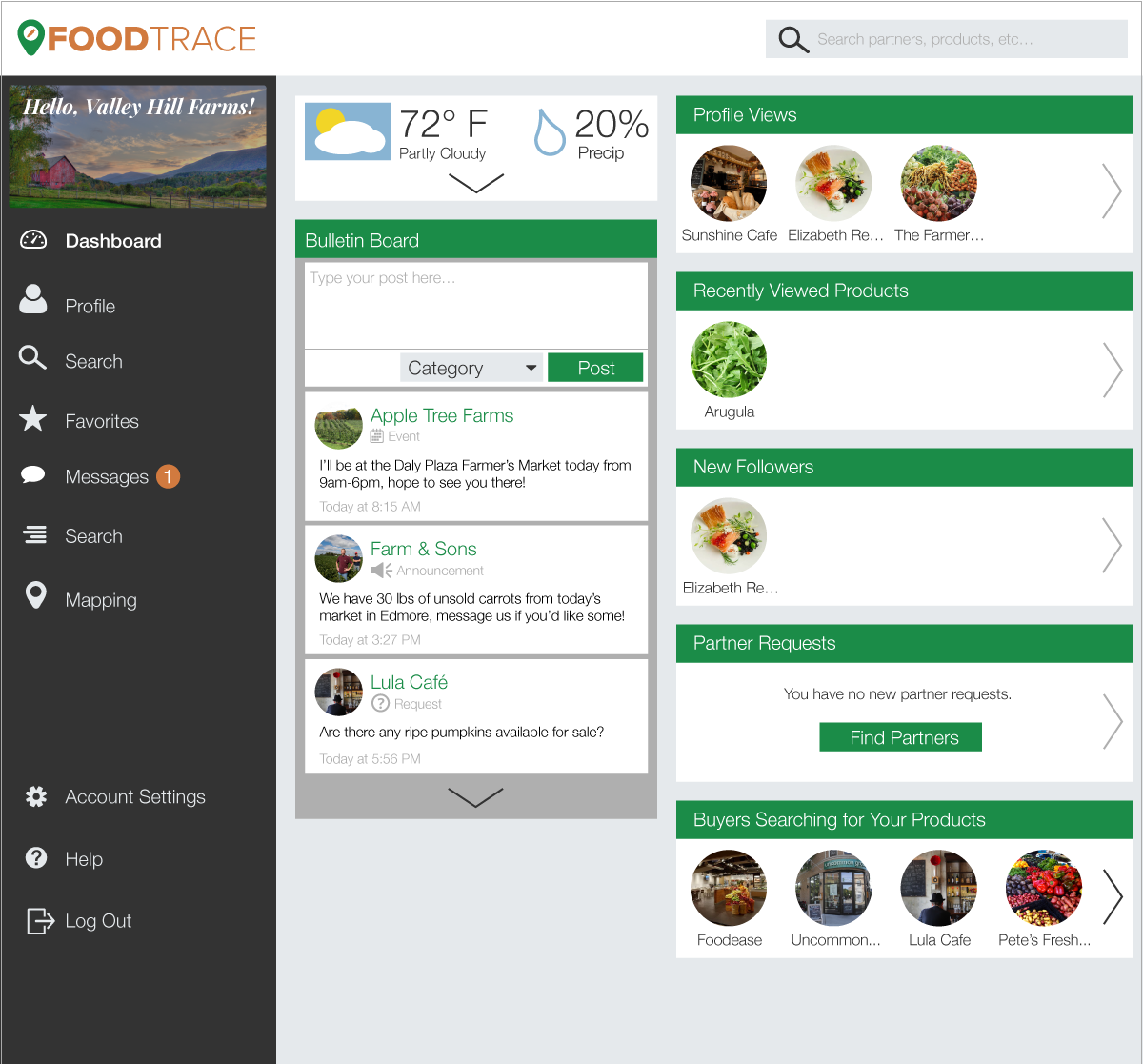
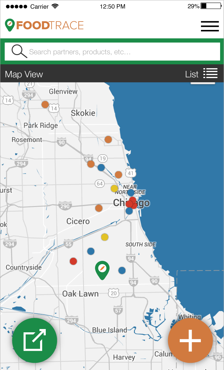
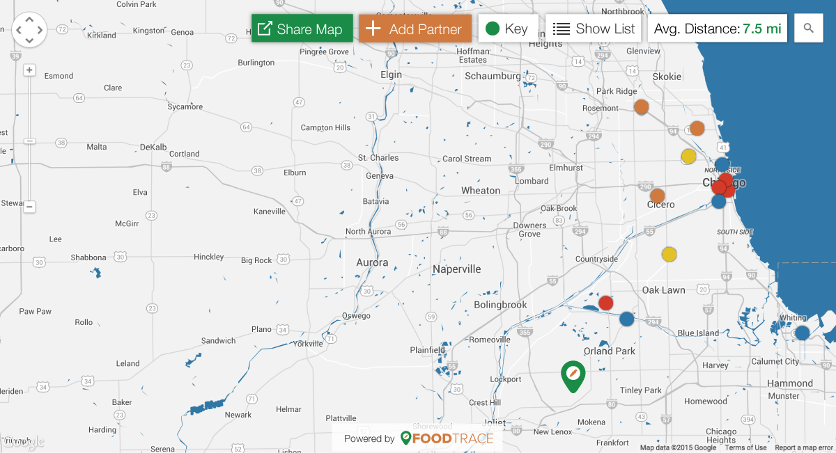
I altered the layout and navigation of the mobile app from my initial mockups to better correspond with the desktop layout of the app and make a more responsive design.
Dashboard
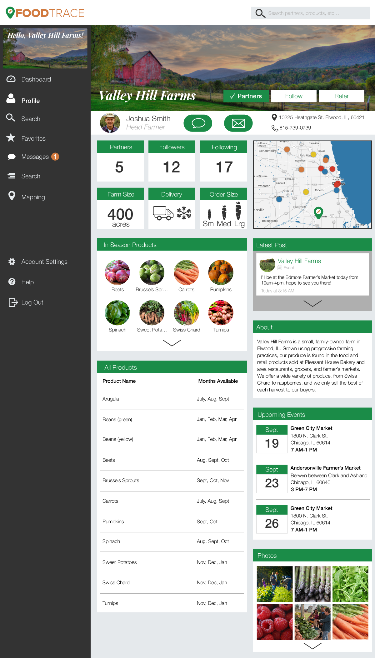
Profile Page

Vendor Map
results
FoodTrace was my first project that involved existing brand constraints. Luckily, FoodTrace was flexible and allowed some leeway with their previous style choices, but I had to ensure that my design fit their existing brand attributes. The required responsive layout added an additional constraint that proved surprisingly challenging.
Designing for a non-consumer user was also a learning experience. Business owners are concerned with facts: numbers, locations, services and products available. I had to prioritize content that isn’t typically visually appealing, and create an interface that displayed that information in an attractive way.
In the end, I was able to create a design that was improved by these constraints, rather than limited by them. I was able to maintain FoodTrace’s brand identity and priortize content without compromising aesthetics.