guardllama
mobile app & website · 2015
role: ui designer · client: guardllama · process: design-thinking approach
Guardllama is a Chicago-based start up that sells a personal safety app accompanied by a bluetooth remote that enables the user to set off an alarm without having to access their phone. While a wide array of personal safety apps are available on the market, Guardllama is the only brand to offer a remote that pairs with the app. I worked with Guardllama to redesign their app and the landing page of their marketing site.
The Guardllama project allowed me to test my ability to design a mobile app and corresponding marketing site that had a consistent brand identity despite their functional differences. Because personal safety is such an emotionally charged topic, the look and feel of both products needed to be carefully considered. Overall, Guardllama was a test of my ability to maintain balance, consistency, and sensitivity in a multi-product design.
tasks
exploratory research · personas
journey maps · sketches
wireframes · prototype
branding · style tiles
style guide · high-fidelity mockups
competitive analysis
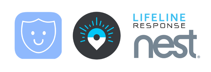
I researched some of Guardllama’s competitors and inspirations to find ui patterns and opportunities.
takeaways
- Color schemes are typically soft and cool, with blue being the most prominent accent color
- All sites used sans-serif fonts for headers and body text
- Site and app designs were very minimal and simple
finding a style
Guardllama wanted their brand to emphasize safety and comfort, avoiding any fear-based marketing or branding techniques that some of their competitors used. They also wanted to maintain the existing brand elements (logo and color scheme). I created two different style directions to consider.
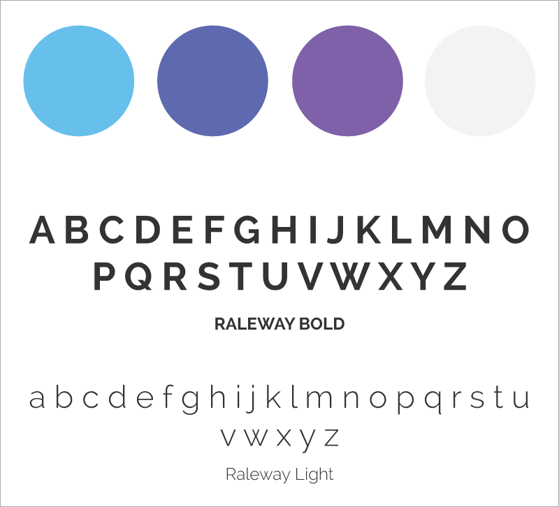
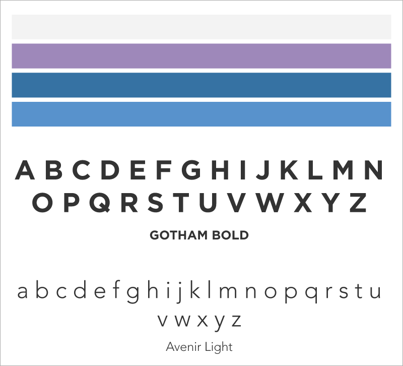
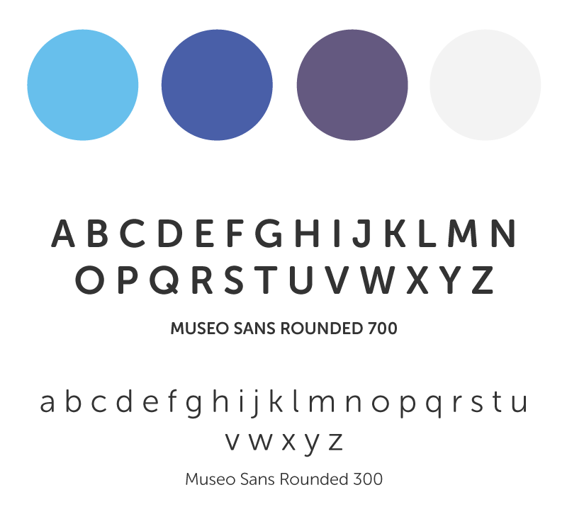
After receiving feedback on the styles I had created, I chose to flesh out an even friendlier, more approachable style.
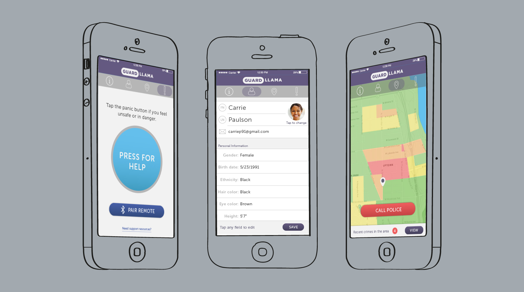
I used wireframes from previously-conducted ux work to create a series of mobile app mockups. I kept primary navigation at the top of the screen, saving the more accessible real estate on the screen for more imporant actionable buttons.
mobile app mockups
landing page mockups
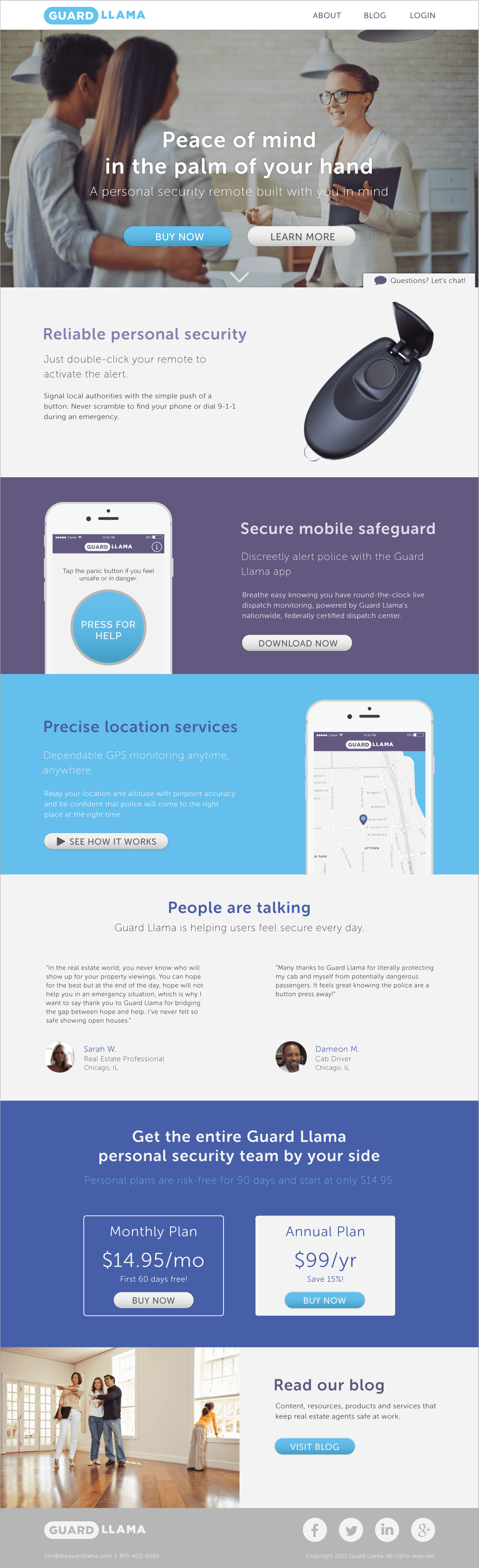
Guardllama also asked me to design a new landing page for their marketing website. I maintained the general layout and order of the existing page, but I edited the copy to give a more subdued, friendly feel to the page.

results
Guardllama had the strictest design constraints I had faced yet. The clients I worked with allowed minimal flexibility with the logo and brand colors. Other design elements still had limitations because of the charged nature of the personal safety market. I spent more time debating the psychology behind each design choice than I had on any other project.
Ultimately I created a design that reflected the Guardllama brand through both the app and the marketing site without compromising functionality in either platform.