




tree to form
branding & website design · 2016–2017
role: visual designer · client: tree to form · process: design-thinking approach
My fianceé Sam has been creating custom woodworking projects since 2012. In 2014 we founded Tree to Form, a side project that we’re working to develop into a full-fledged small business. Late last year I began work on the Tree to Form brand, creating a logo, choosing brand elements, and designing mockups for the website.
Most of my design work has been with tech-oriented brands that look and feel at home on a computer screen. Tree to Form presented an opportunity to work with brand attributes that don't translate to the web as easily. Sam and I wanted visiting the website to feel like stepping into his workshop — intimate and tangible. We also knew we needed to balance our desire for authenticity with current design trends and usability conventions to ensure a memorable and positive user experience.
tasks
competitive analysis · logo design
content strategy · copywriting
branding · responsive mockups
branding
The name Tree to Form was Sam's brainchild. Influenced by the themes of books like George Nakashima’s The Soul of a Tree and Viktor Papanek’s Design for the Real World, he wanted the brand name to stress his commitment to accentuating the natural beauty and strength of wood through his designs. He’s also a sucker for puns.
the logo
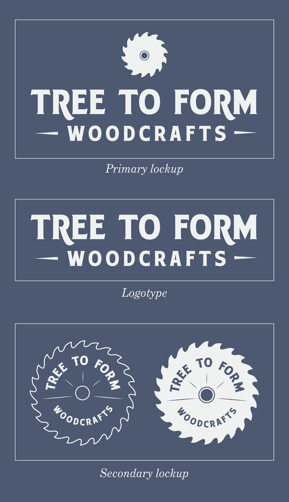
Sam and I agreed that we liked the bold lines and symmetry of circular saw blades, and wanted to incorporate this shape into the logo. Not only does a saw blade have a memorable silhouette; it effectively communicates the service Tree to Form offers. After a cursory Google Image search, I discovered there is an enormous variety of circular saw blades.
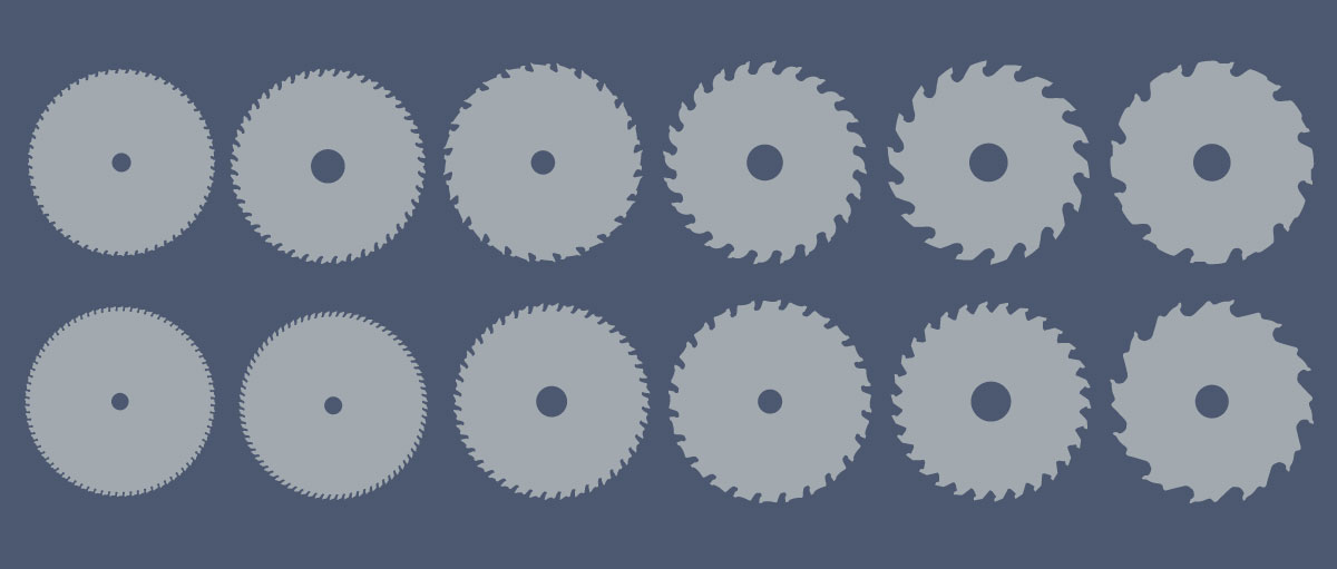
We decided against a hyper-realistic silhouette. The sharp angles and minute details of actual saw blades did not scale well, and we agreed a small amount of asymmetry would add charm and character to the logo. I drew a saw blade with curved, fluid teeth using the pen tool in Illustrator.

We chose a bold letterhead font, Hensler 2, to pair with the sawblade. I took advantage of the alternate glyphs included with the font, creating a stronger typeform that could stand on its own when necessary.
I created a few different lockups that could be used in a range of contexts, from business cards to store front windows.
competitive analysis
I viewed dozens of websites for inspiration and guidance on design and content strategy.
Many woodworking sites I encountered in my research were outdated and stuffy, and did not provide useful inspiration.
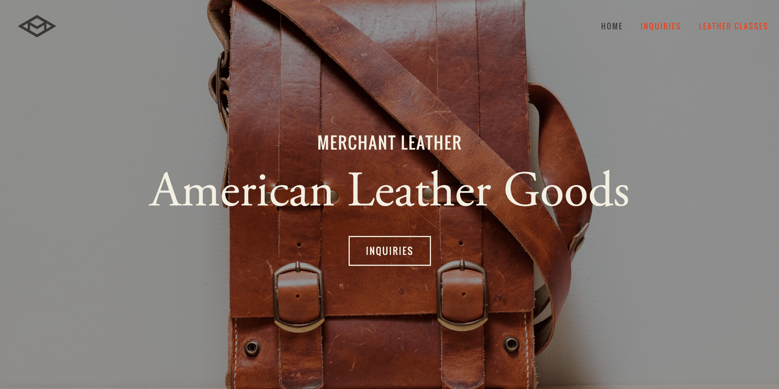
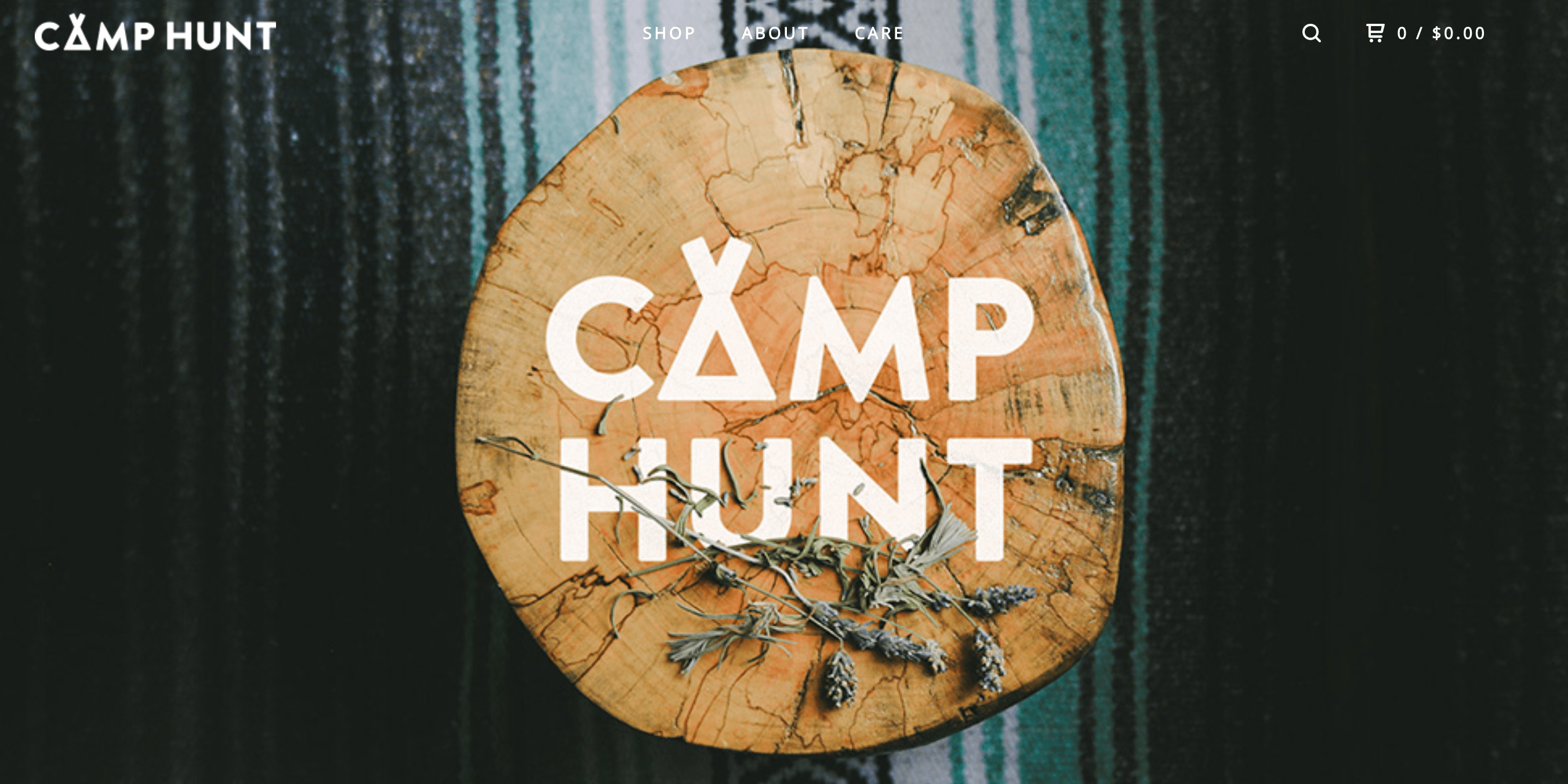
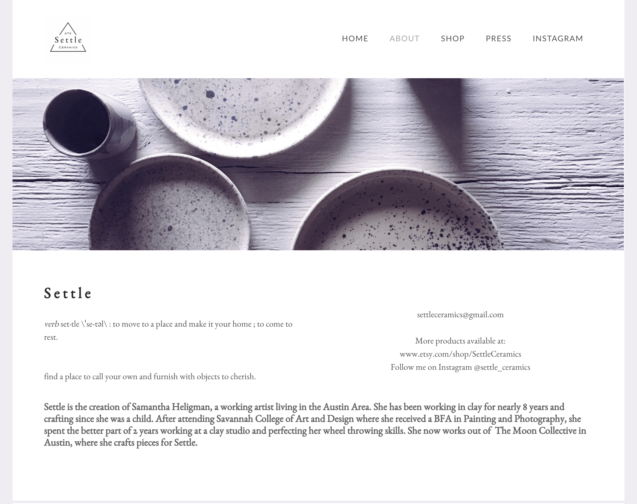
To find examples of brands that more closely fit our intended aesthetic, I looked on the Renegade Craft Fair blog to find featured ‘makers,’ or purveryors of handcrafted goods, who employed a look and feel similar to the one we desired.
takeaways
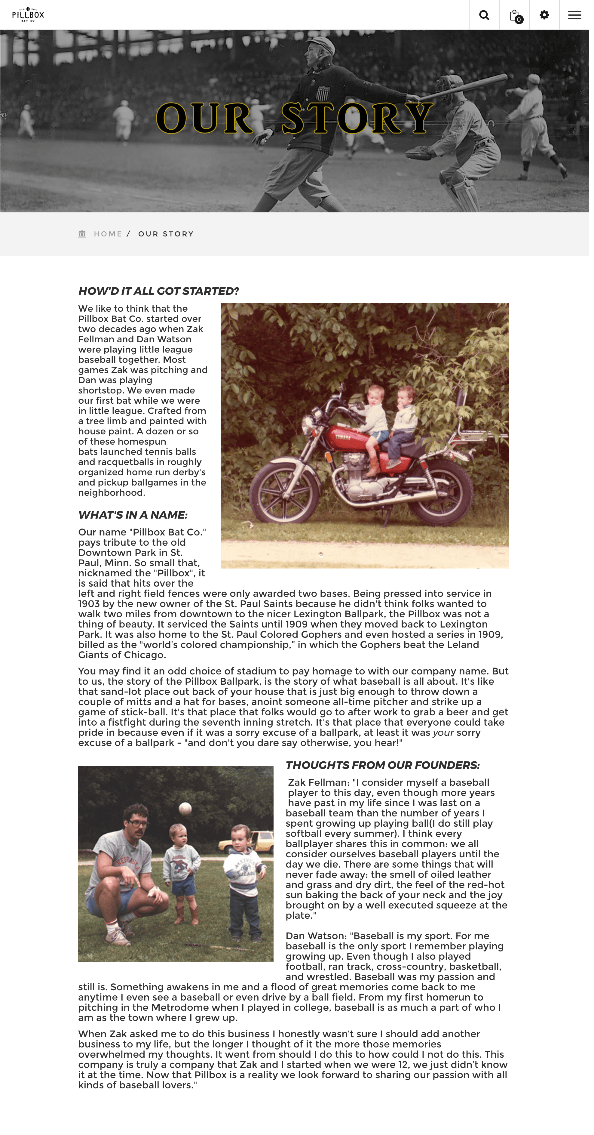
- Prominent, striking photography serves to showcase the product while establishing a branded aesthetic
- Large font size and bold typography provides additional opportunity to communicate brand attributes
- A lot of website copy was either sparse and cold, or unfocused and rambling
- Minimal color schemes were a noticeable trend
content strategy
Sam and I deliberated and agreed our brand should reflect the most attractive qualities of wood. Tree to Form is bold, tangible, and warm — I conveyed those attributes through the photography, copy, brand colors, and typography used on the site. After completing my competitive analysis, I focused on organizing and creating the content that would populate the pages of the Tree to Form website.
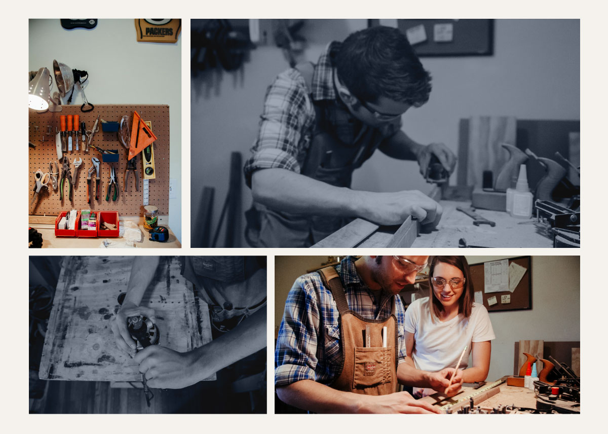
The vast majority of sites I encountered in my research used prominent, high quality photography on their websites. Chicago photographer Sandra Armenteros shot a beautiful set of photos featuring me and Sam working in the shop together. She perfectly captured the intimate, genuine feel we wanted. I used her photos throughout the site, either in full color or with a branded blue filter. Most pictures provide a close-up view of Sam at work on a project. They are a virtual invitation into the shop, displaying a pride in tools, process, and materials.
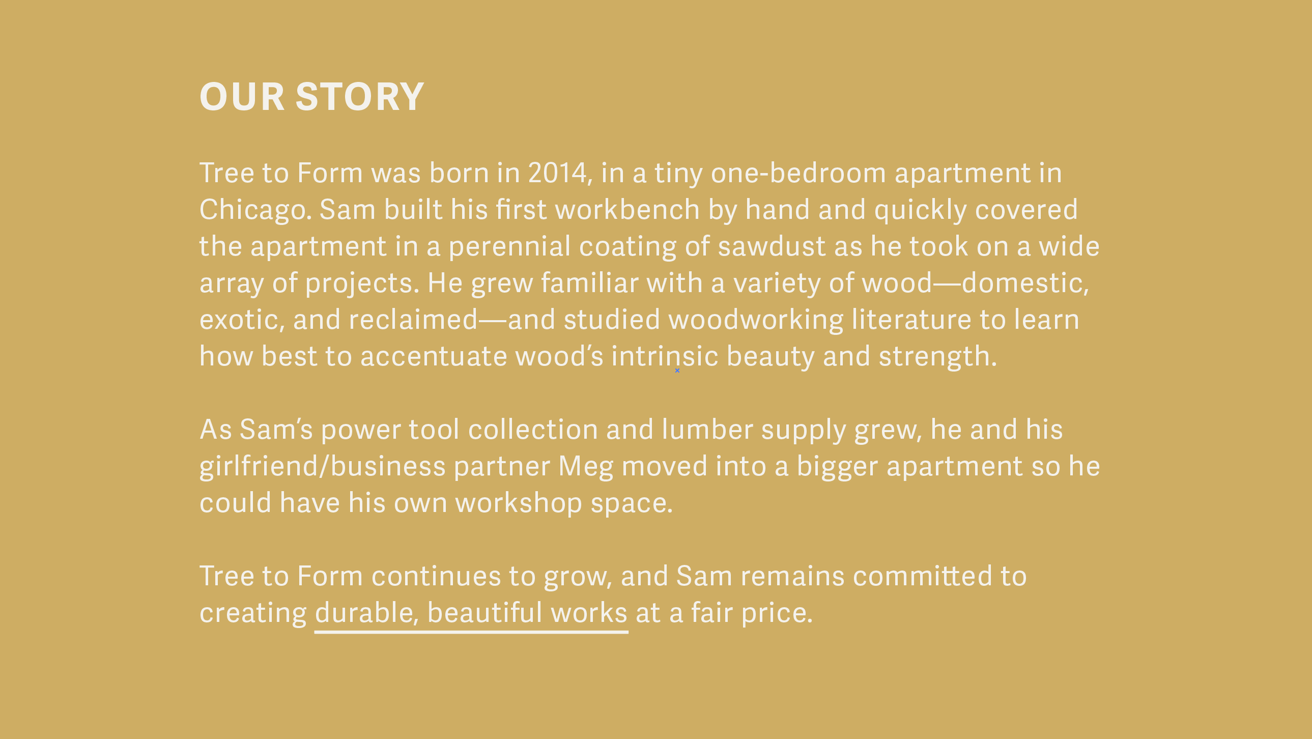
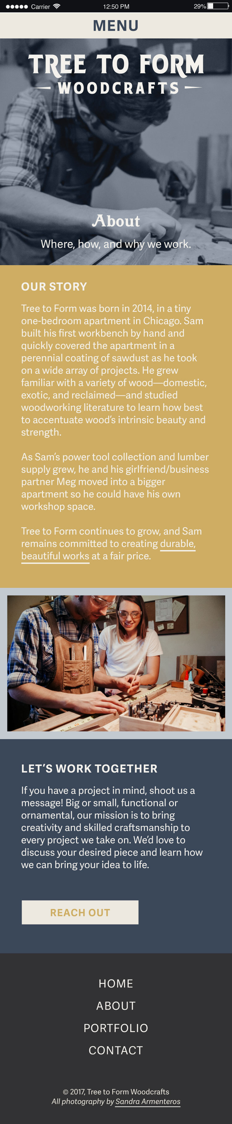
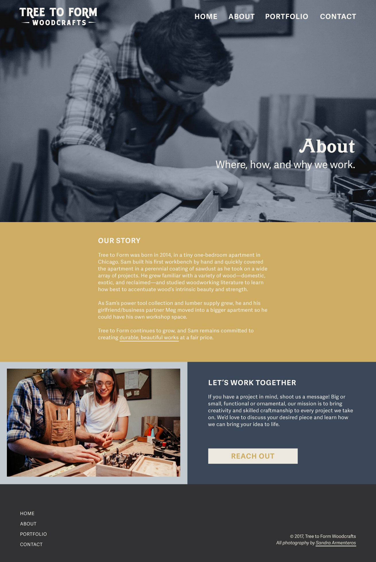
I wrote the site copy myself, crafting a casual, competent, and passionate tone. I focused on the narrative and motivation behind Tree to Form, welcoming site visitors into our workshop by offering vivid imagery in the sincere and personal summary of Tree to Form’s history and work philosophy.
finding a style
Considering the overwhelming number of websites displaying and selling handmade craft goods, I felt our brand would stand out best if our design departed from key conventional trends without sacrificing modernity or professional polish.
color
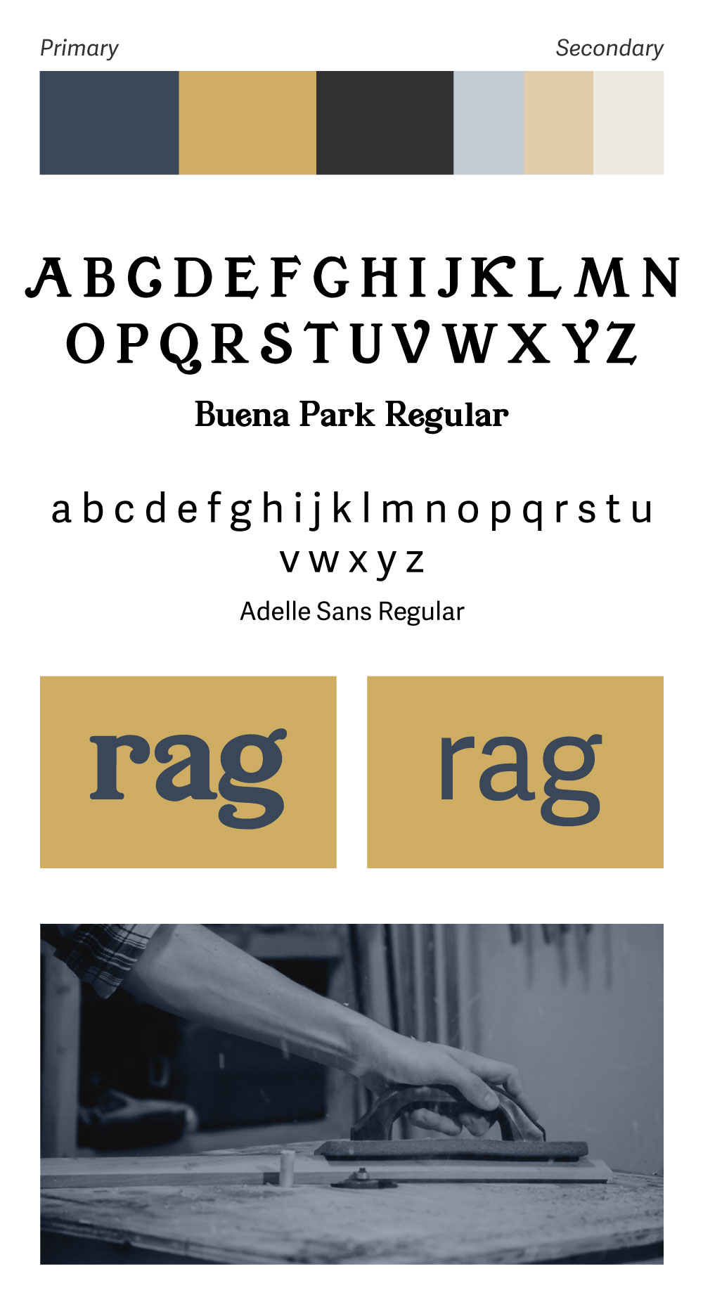
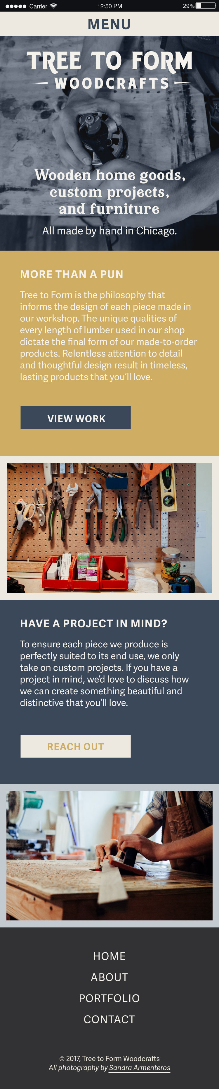
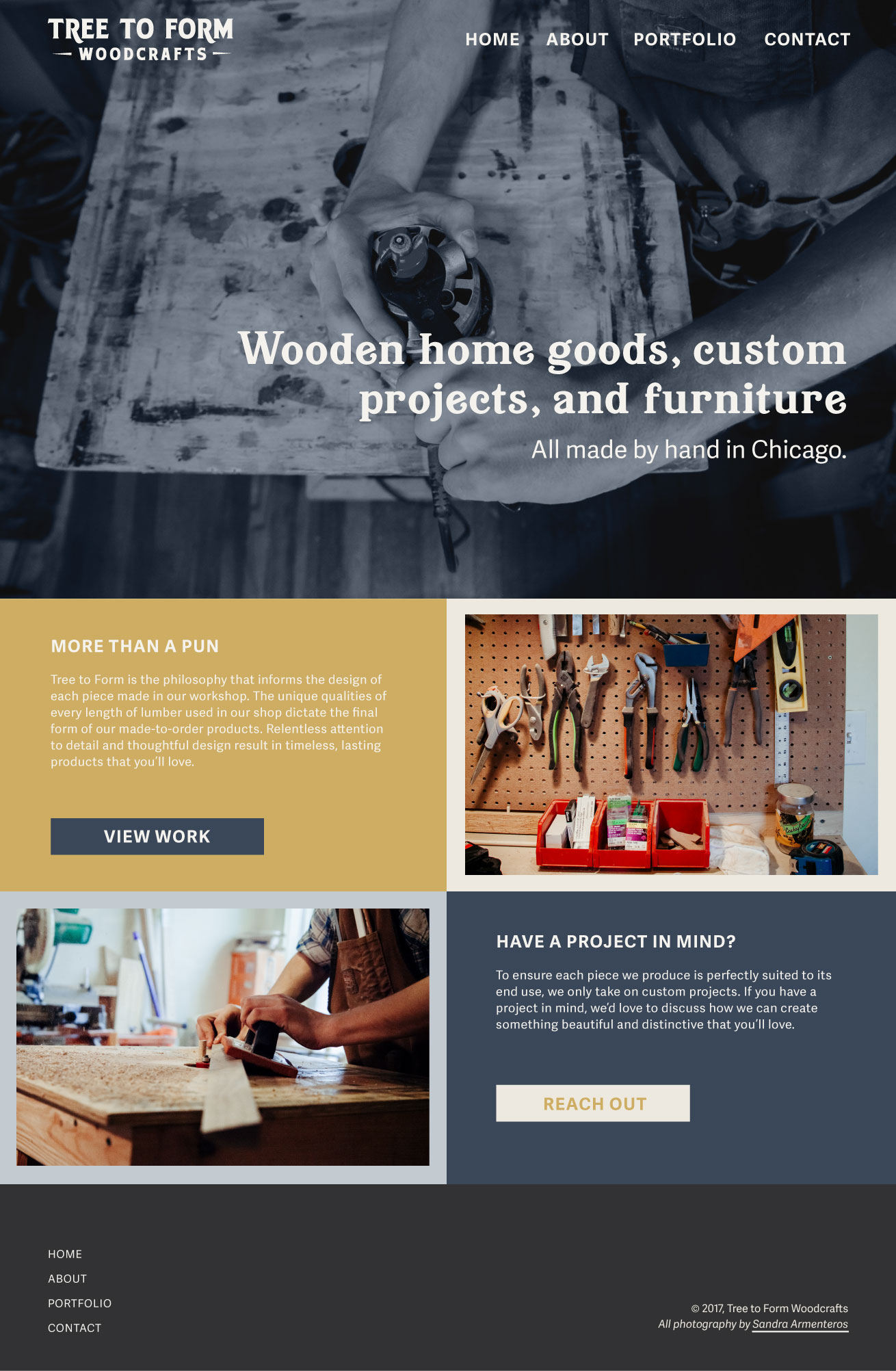
I chose a complementary color scheme centered around a timeless navy and gold that won't feel dated by next year. Unlike the many other sites featuring minimal color schemes with clean, white backgrounds, I chose to saturate the background with our brand’s boldest colors.
typography
I chose Jukebox Fonts’ Buena Park for large headers. Its playful serifs and bold, low-contrast strokes make a strong impression, especially when displayed at a large size.
I chose typetogether foundry’s Adelle Sans for various subheads and body copy. This humanist font family pairs beautifully with Buena Park, and includes a true italic that, used sparingly, adds a touch of formality and professionalism to the site.
photo filter
I gave every hero image the same treatment: a blue monochrome filter. This served the dual purpose of increasing the readability of the headlines and keeping the focus on the action and subject of the image itself.
mockups
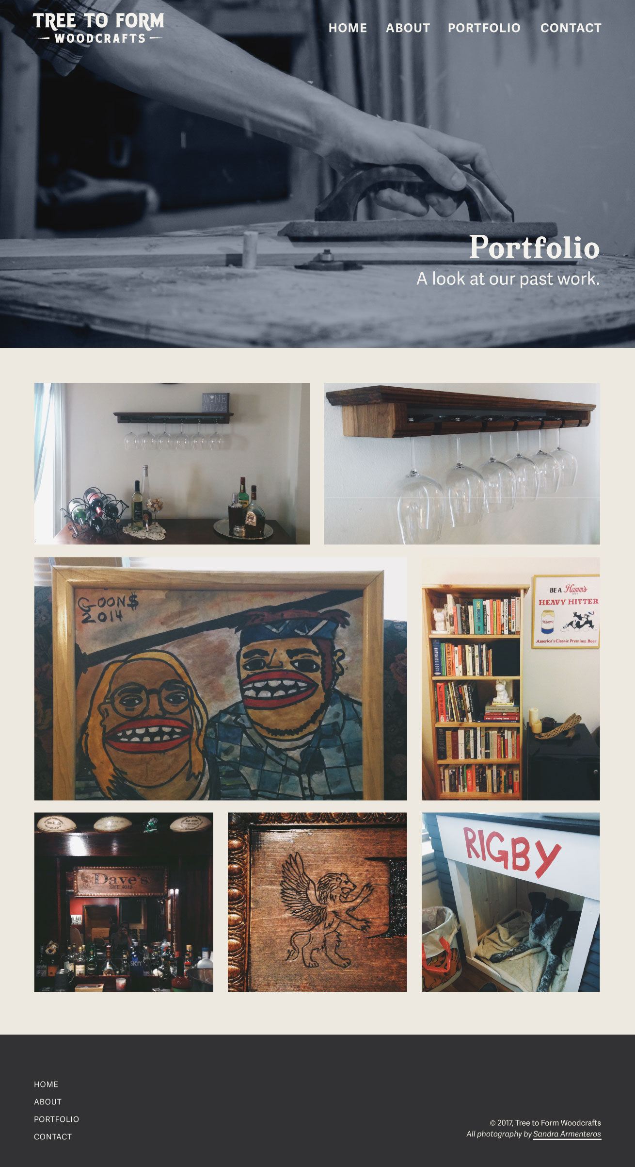
I created responsive mockups to flesh out the design and ensure our chosen elements interacted fluently. Because so many of those elements were purposely chosen for their distance from current trends, I decided a highly modular layout with generous whitespace would keep the site looking modern and stylish.
Home Page
About Page
Portfolio Page

results
Tree to Form is my first ongoing design project, and the branding process was the most involved and thoroughly-researched I’ve executed to date. Sam and I are both very happy with Tree to Form's brand identity, and are excited to see the reaction it elicits from potential customers.
Looking to the future, I will research and purchase a website template that will ensure customers can make secure credit card transactions online — a backend skill I unfortunately don't have. Additionally, we are going to shoot thoughtfully staged product shots and create a contact page where visitors to the site can submit inquiries and place custom orders.
I will continue to conduct research on ecommerce ui and ux design, tweaking my designs in an iterative process to boost sales and customer engagement. We will likely begin publishing a weekly newsletter by the end of the year to further this goal.