huddle
online learning platform · 2015
role: ui design and branding · client: designation · process: agile method
Online learning is a booming industry, especially for tech subjects like design and development. Unfortunately, users consistently encounter obstacles that prevent them from having the best learning experience possible. I worked with designation on a team of four (two ux designers and 2 ui designers) to create a platform that would address and eliminate common frustrations and road blocks in the online learning experience.
Huddle was my first design-oriented team project. My ability to work with others was tested and improved, and I learned the challenges that face a team working on a creative assignment together.
Huddle was a project that involved a fast pace and condensed timeline. I produced quality creative work on a tight deadline and coordinated with my team to ensure we were able to deliver a satisfactory product on schedule.
tasks
exploratory research · branding
moodboards · style tiles
mockups · style guide
prototypes (paper and Invision)
research
While the ux designers studied competitors, conducted interviews, and synthesized data, I studied the ui elements of existing online learning platforms.

takeaways
- The volume of subject matter dictates the complexity of the site, from the color scheme to the information architecture
- Color-coding is a popular and efficient way to organize and label wide-ranging categories of material
- Each site had a lone prominent call-to-action on the landing page
ux work
the problem statement
After completing their research, the ux team presented their findings and together we created the problem statement that would shape our learning platform.
Users lack a sense of community in the online learning experience. Facilitating a learning community could provide users additional resources and motivation and decrease the amount of frustration typically felt when completing online courses.
To address our problem statement our team decided to create a platform where users could learn in a group setting.
design principles
I created design principles that would guide our decisions as we created our product.
Our product should be:
- Flexible: We will facilitate community learning without impeding independent learning
- Open: We will be welcoming and useful to learners from all levels of expertise
- Engaging: We will encourage interaction between site members
the product
With a problem statement and design principles to guide our process, our team was ready to ideate. Each team member sketched rough paper prototypes.
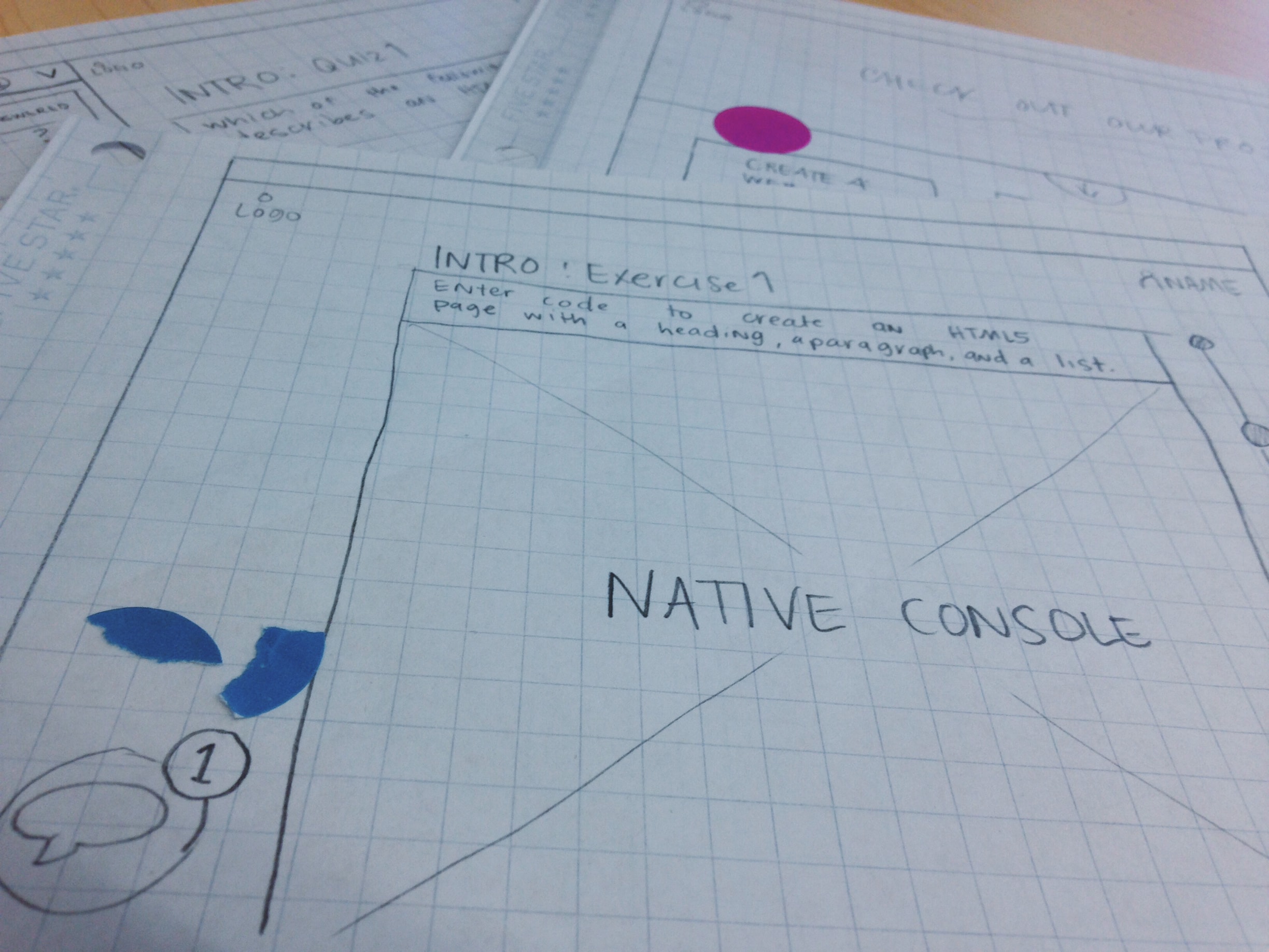
We reviewed all our sketches and incorporated internal feedback into two different paper prototypes, each featuring a different approach to group learning. I sketched the prototype below, which loosely groups users according to the courses they enroll in. Communication and interaction between group members is facilitated and encouraged through that course's unique forum. Individual learners can complete the coursework on their own schedule while creating connections based on common interests and goals.
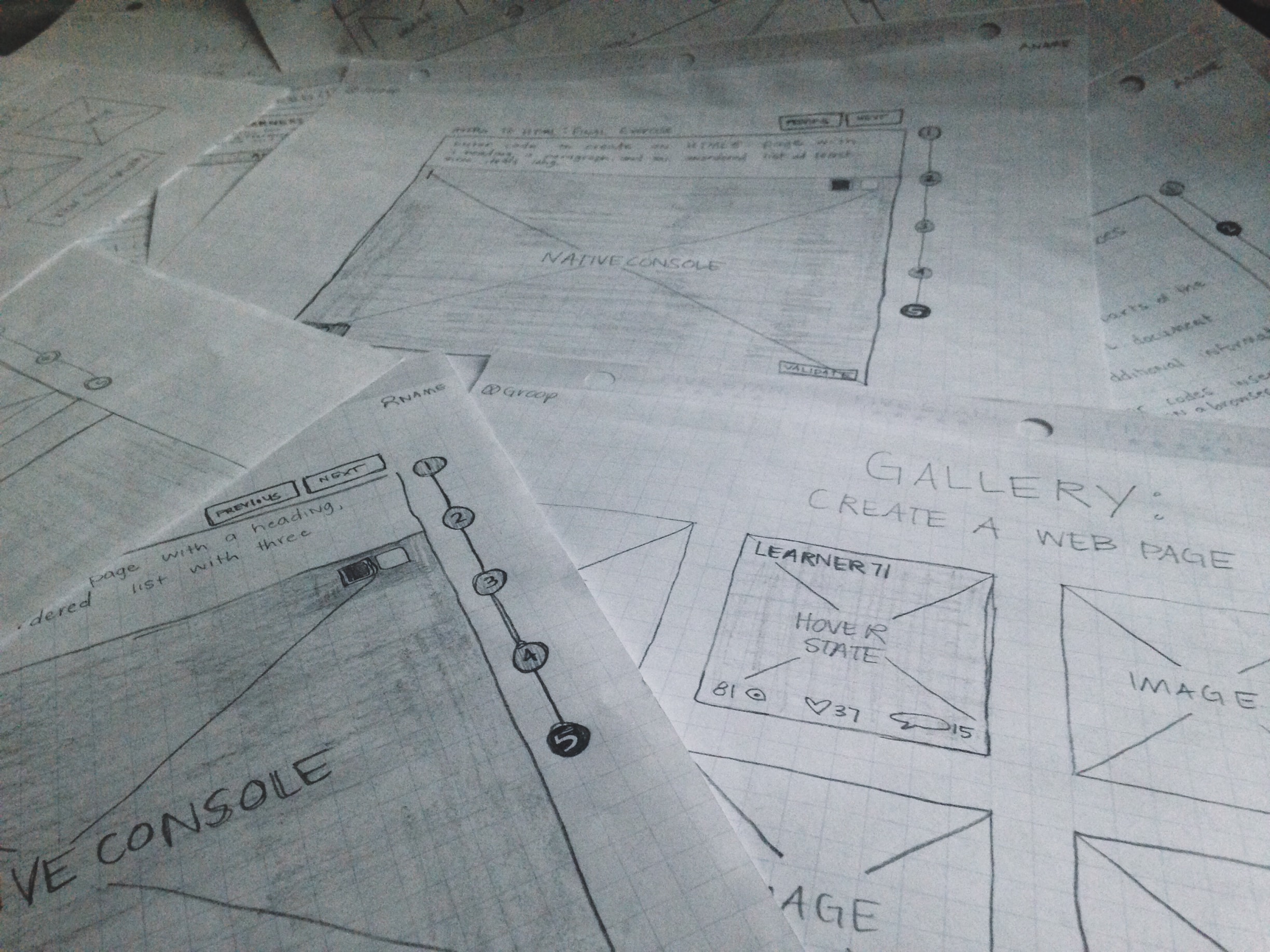
The UX designers used these prototypes to complete the first round of usability testing.
takeaways
- Users responded positively to the idea of learning in tangent with a small group of people
- Users did not feel as engaged in a community when groups were much larger
- The idea of starting online courses on a set schedule did not deter users
My prototype, which featured a flexible course schedule with large groups of learners asking questiong and sharing course advice via forums, was not the right model for our product. We decided to adopt the other prototype, which organized users into small groups that would complete the same course together on a set schedule.
The ux designers created high-fidelity Axure prototypes to test different ways to facilitate and encourage interaction in the smaller learning groups.
branding
Now that our team knew what we wanted our product to be, we needed to create a brand that would reflect our design principles. Our team brainstormed dozens of possible brand names…
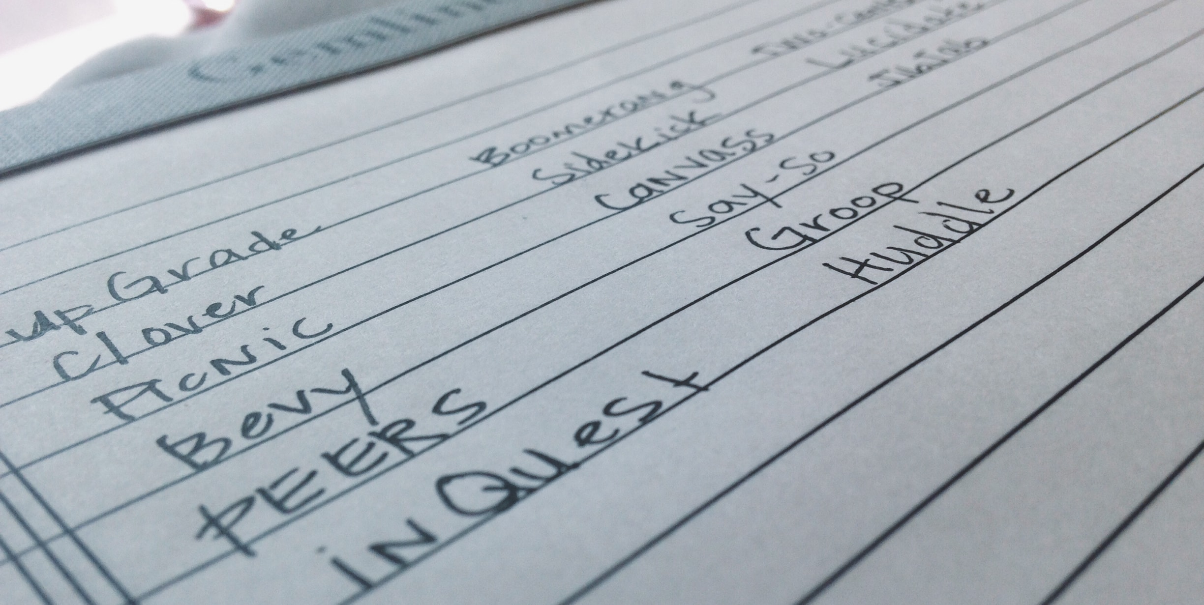
Our team wanted our brand name to reflect a feeling of community and strength-in-numbers. We gravitated toward shorter names like Picnic, Clover, and Bevy, but none of these names were striking enough to represent our brand. We briefly (and tentatively) agreed on Groop, but before our first round of wireframes were complete we finally found the right name: Huddle.
Huddle has connotations of teamwork, common goals, and strategy. It sounds friendly, but not cutesy.
the logo
The word ‘huddle’ has distinct feeling and imagery already associated with it, and I wanted to take advantage of that. I tested a few different ideas, looking for a logo that would convey a feeling of proximity and teamwork.
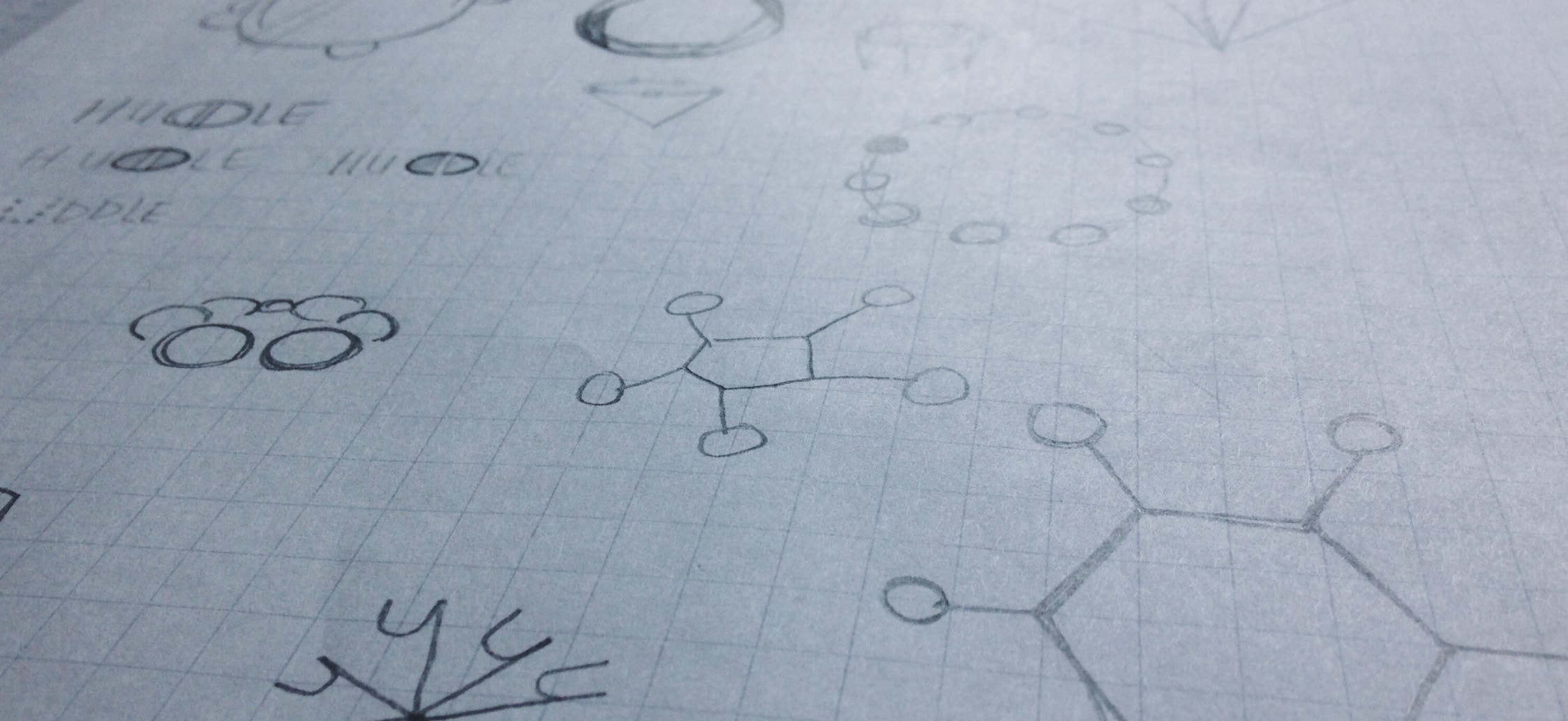
After expanding on some of my sketches, I decided on the most literal interpretation:
Round, friendly, and easily scalable — an actual huddle of circles next to our name made for a simple and compelling logo.
finding a style
As the ux designers built and tested their prototypes, I explored possible style directions for the Huddle brand.
moodboards
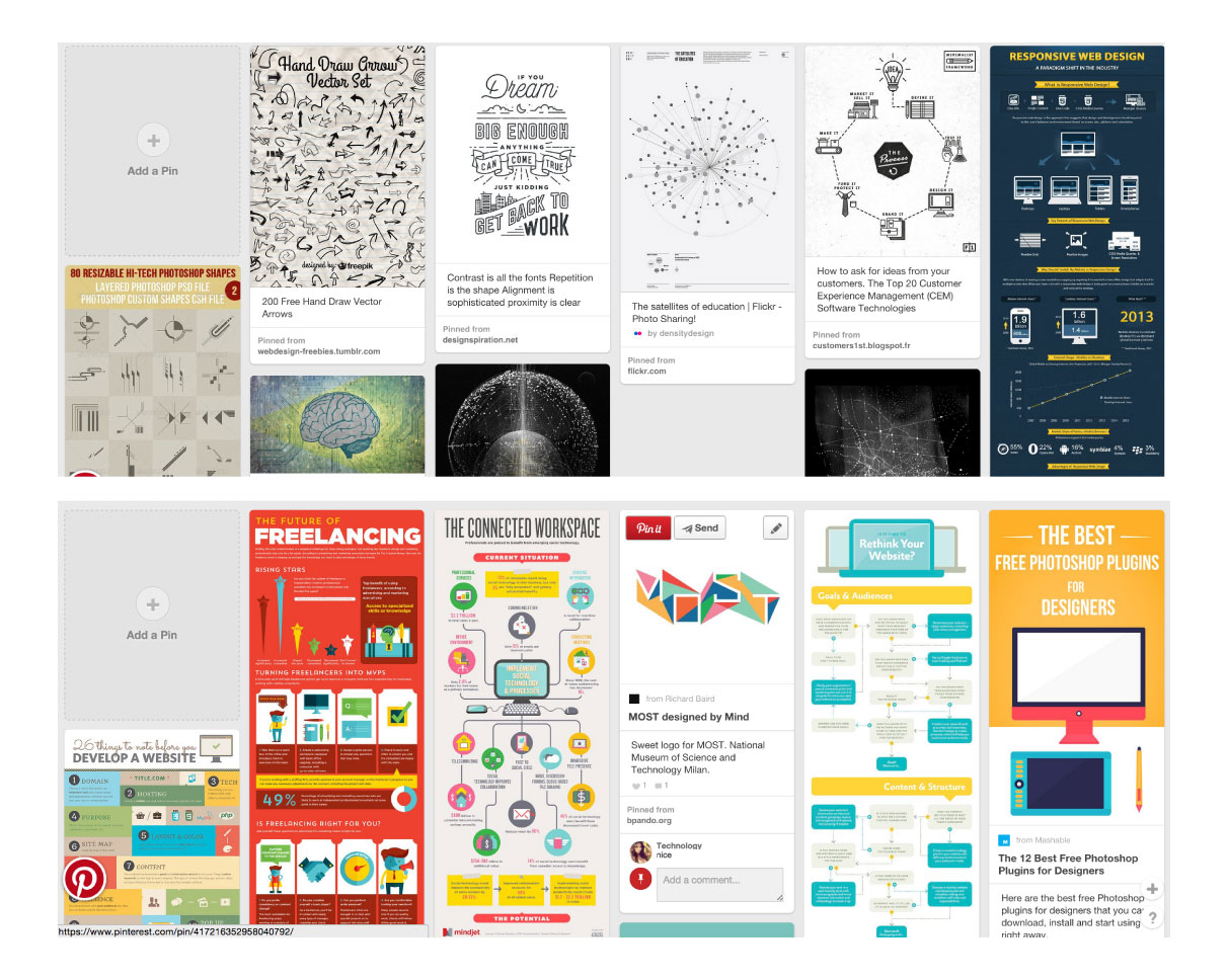
We wanted the brand to be friendly, lively, and engaging, but I didn't want the interface to pull attention away from the course material. I created two preliminary styles.
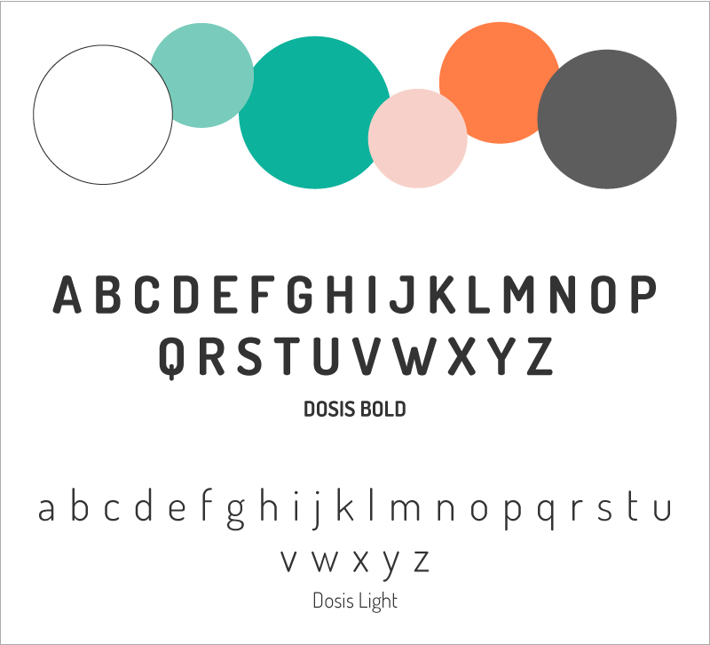
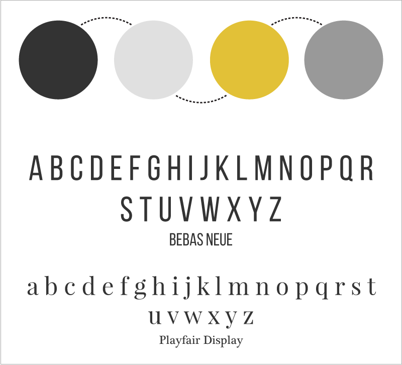
I ended up combining elements from both styles for our final brand look.
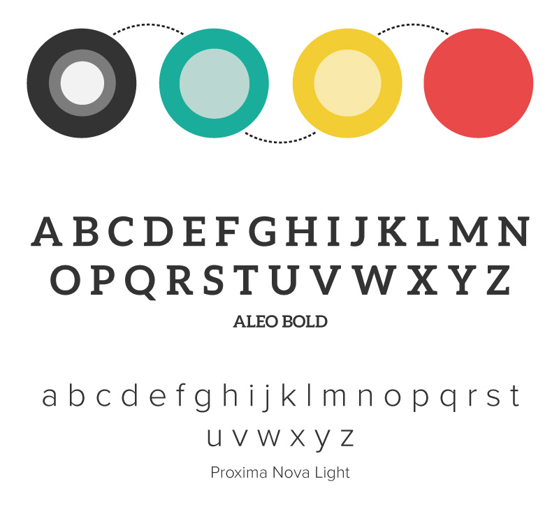
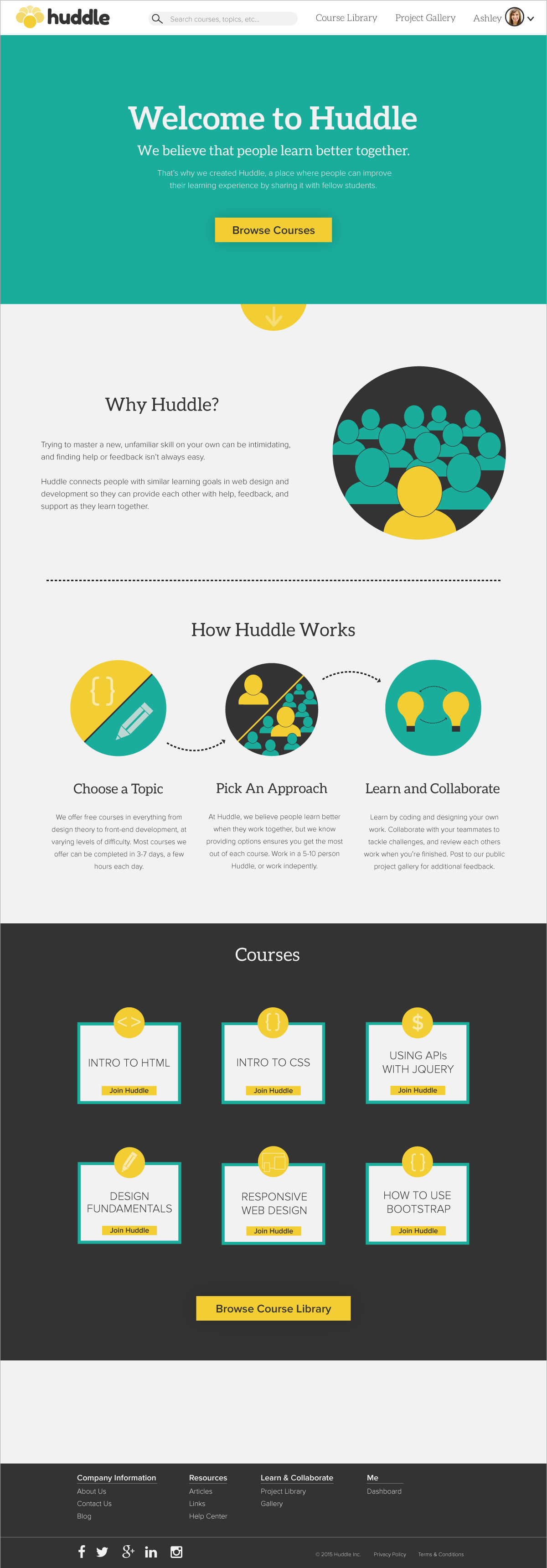
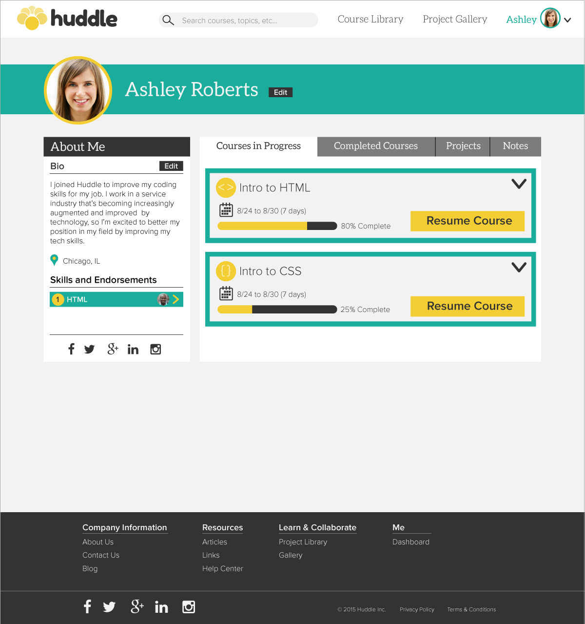
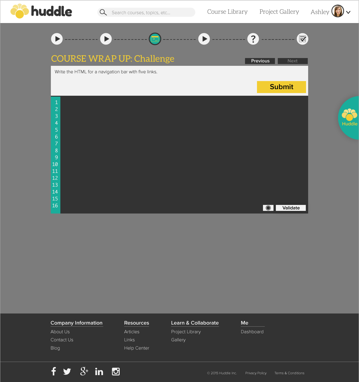
As the ux team finished their last round of usability testing and used their findings to create the final prototype, I applied this style to their screens to create the final high-fidelity mockups.
mockups
results
Working on a team to create a workable product on a seemingly impossible timeline was a fruitful adventure. I learned the art of negotiation and compromise, but also grew to value the inherent benefits that come with working together to make important design decisions. We challenged and vetted each others’ ideas to ensure that the best ideas came to fruition.
On a more personal level, the tight schedule also compelled me to become more familiar with my creative process. Without the luxury of time, I couldn't wait for inspiration to strike. Instead, I relied on moodboarding, sketching, and style tiles to help me find the right visual design for our product.