




coderdojochi
website redesign · 2016-17
role: ux / ui designer · client: coderdojochi · process: design-thinking approach
CoderDojoChi is a volunteer-run nonprofit organization that teaches web, game, and app development to youth ages 7 to 17. The CoderDojoChi website serves two primary purposes: as a marketing site attracting new participants, volunteers, and donors, and as the organizational hub for current volunteers and guardians. I worked with CoderDojoChi to overhaul their website, redesigning the user interface from the ground up, including a full rebranding.
The CoderDojoChi site redesign was one of the most demanding projects I've worked on. Because the website serves multiple purposes, there were many complex pages that required preliminary ux research and iterative rounds of sketches and wireframes. As a tech-focused nonprofit that works with minors, the design constraints I faced were unique and unlike any I had faced before.
tasks
exploratory research · sketches
wireframes · rebranding
high-fidelity mockups
ux work
goals
CoderDojoChi and I discussed the strengths and weaknesses of the current site, and agreed on a set of concise goals to guide the redesign process.
The redesign should focus on:
- Improving site organization and navigability
- Facilitating and encouraging new volunteer and guardian conversions
- Increasing engagement of existing volunteers and guardians
research
As a lone designer volunteering in my free time, I had limited resources at my disposal. The CoderDojoChi website features pages that employ existing patterns — albeit with a handful of unique constraints. I chose to conduct competitive analysis and read existing literature to guide my initial designs.
Competitive Analysis
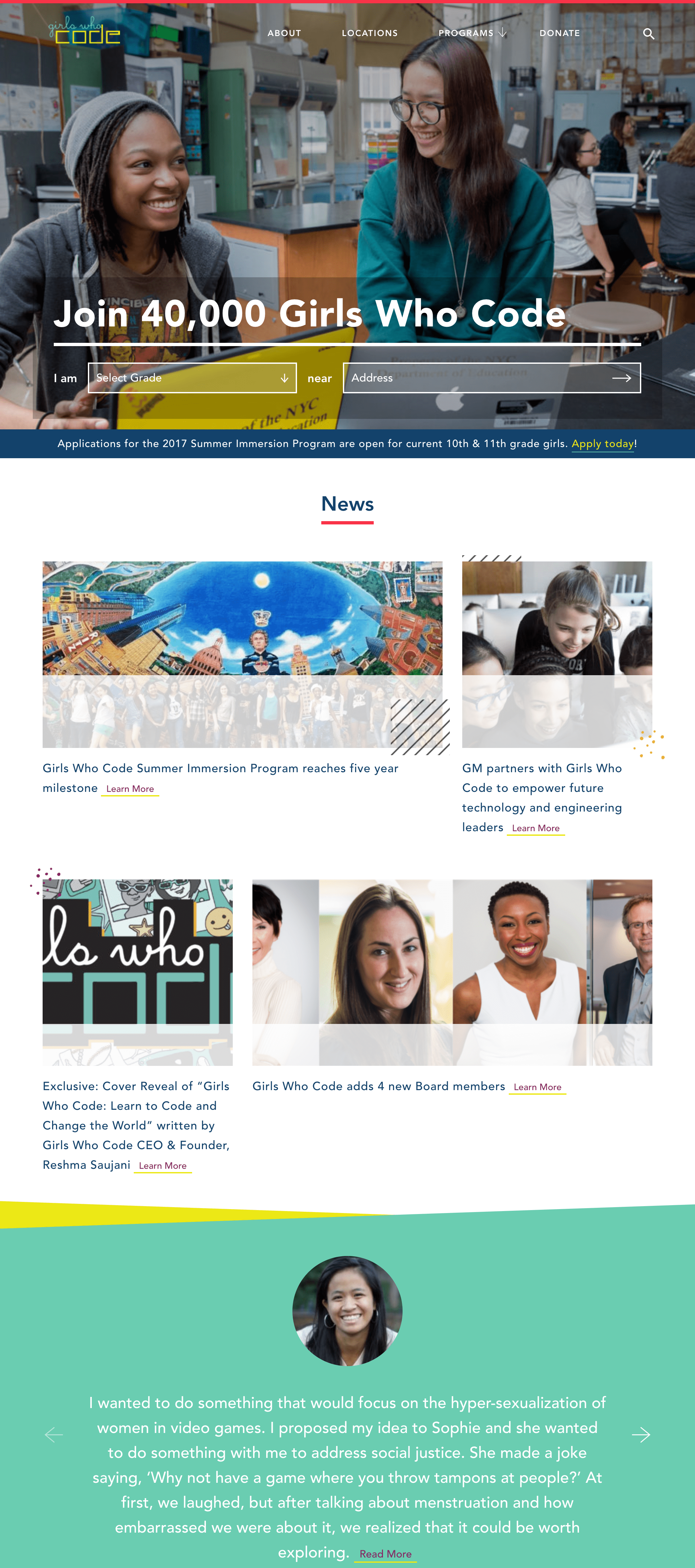
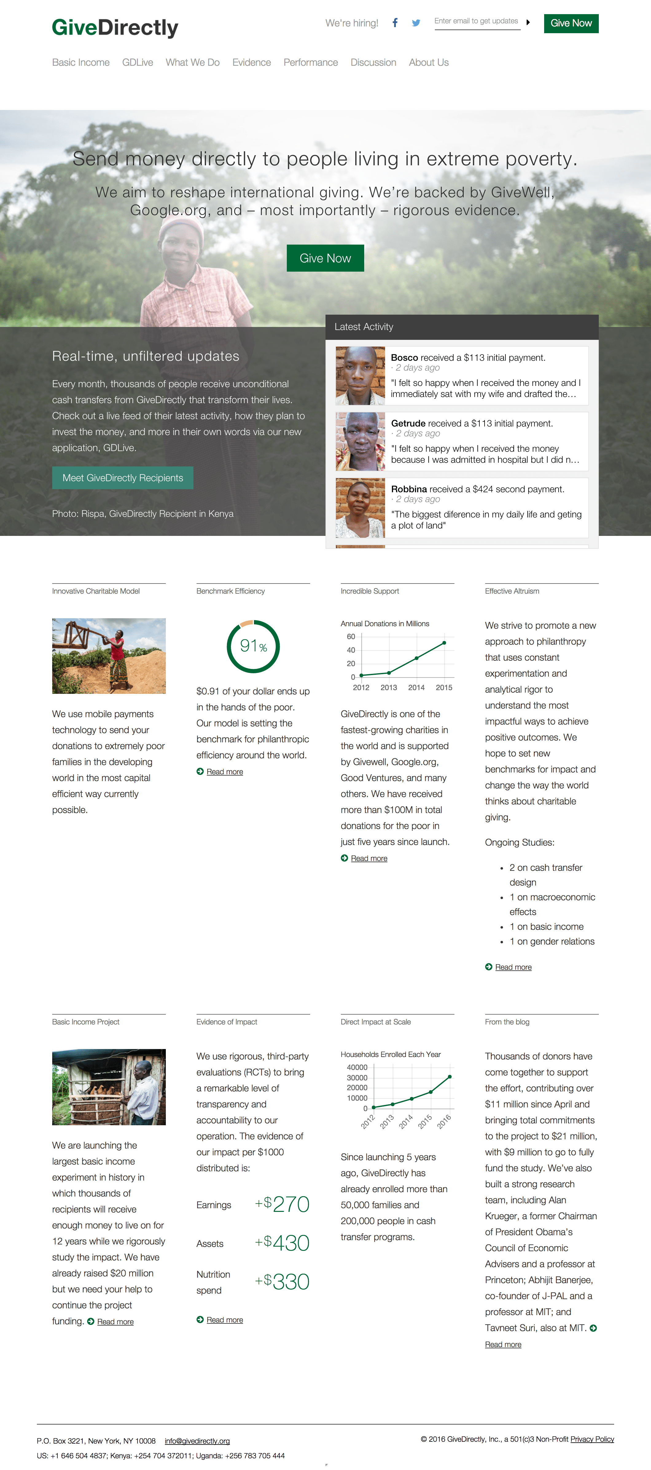
I viewed dozens of websites for examples and inspiration. Other nonprofit sites provided good examples of landing page designs, while sites like LinkedIn and EdX helped inform the redesign of the more complex pages with class and profile information.

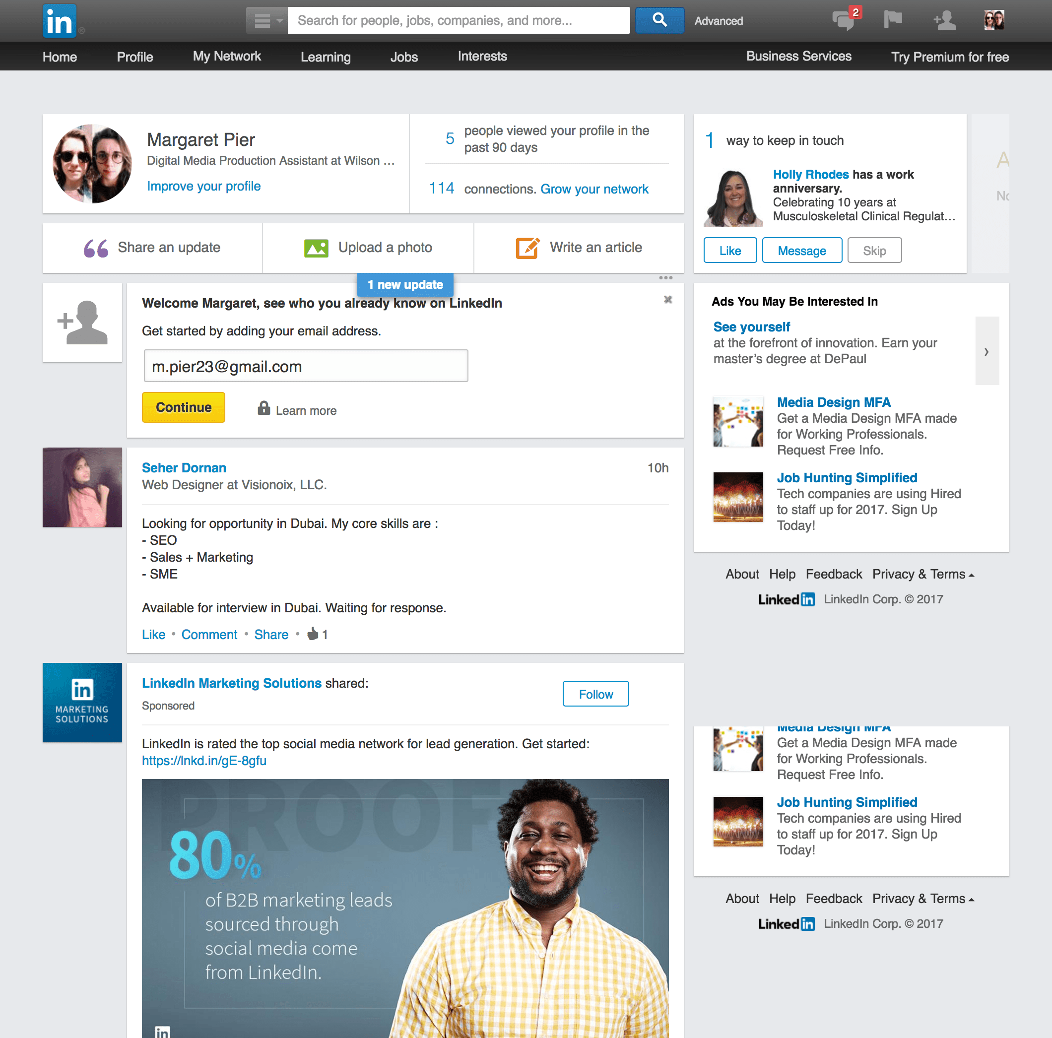
takeaways
- Providing a direct call-to-action — inviting the user to do more than click a button — emphasizes the main priority of the site, and in turn, the main priority of the organization itself
- Nonprofits, moreso than other organizations and businesses, must take advantage of every opportunity to build trust and establish credibility
- Dashboard and summary pages, because they contain substantial amounts of actionable and important information, must be organized and segmented to facilitate quick and easy location and any particular element
Literature Review
I read articles on nonprofit web design from a wide variety of sources, from Nielsen Norman Group to Smashing Magazine. There were several consistent themes throughout much of the literature I referenced.
takeaways
- The website must clearly communicate the organizations mission, work, and and objectives
- Transparency regarding the use of donations increases credibility
- Users choose which nonprofits to donate to/volunteer with based on their own values and goals, and — to a lesser degree — the nonprofit’s impact in their own community
sketches
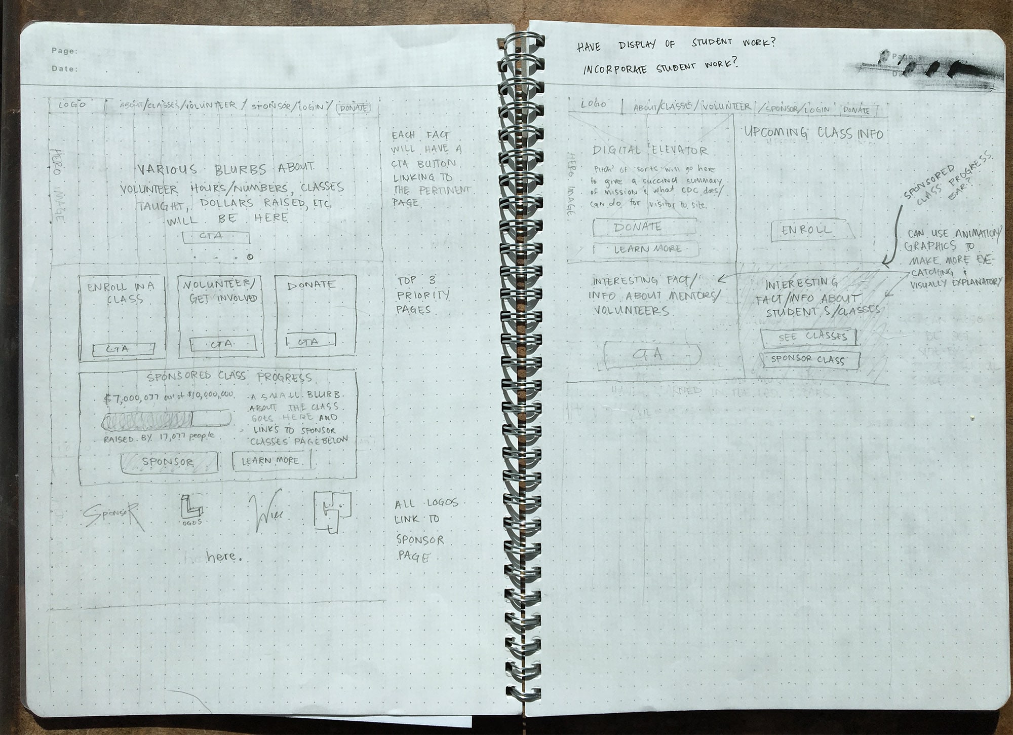
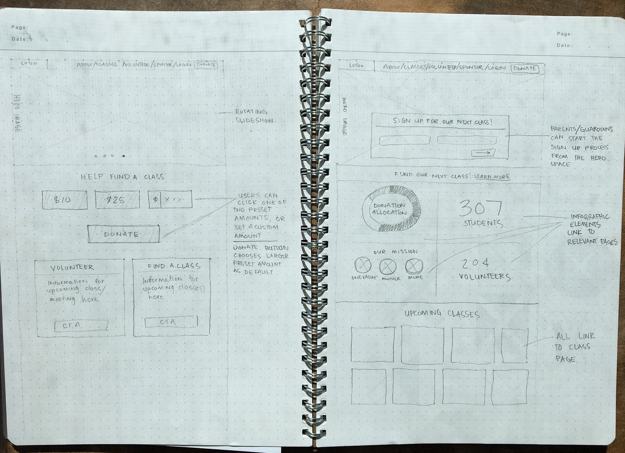
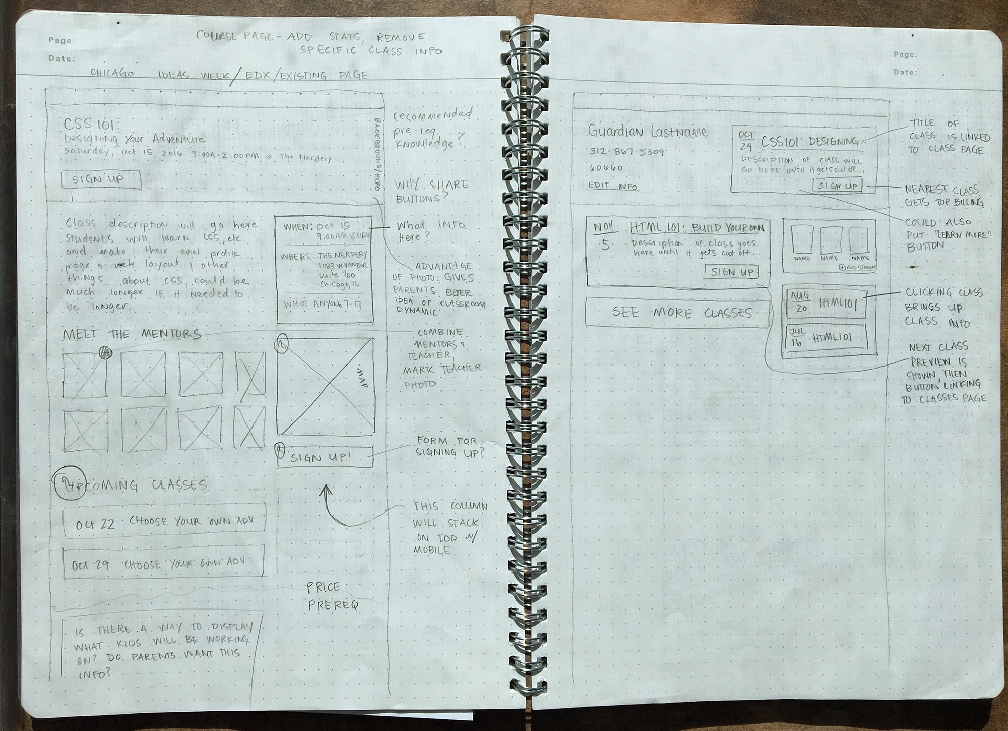
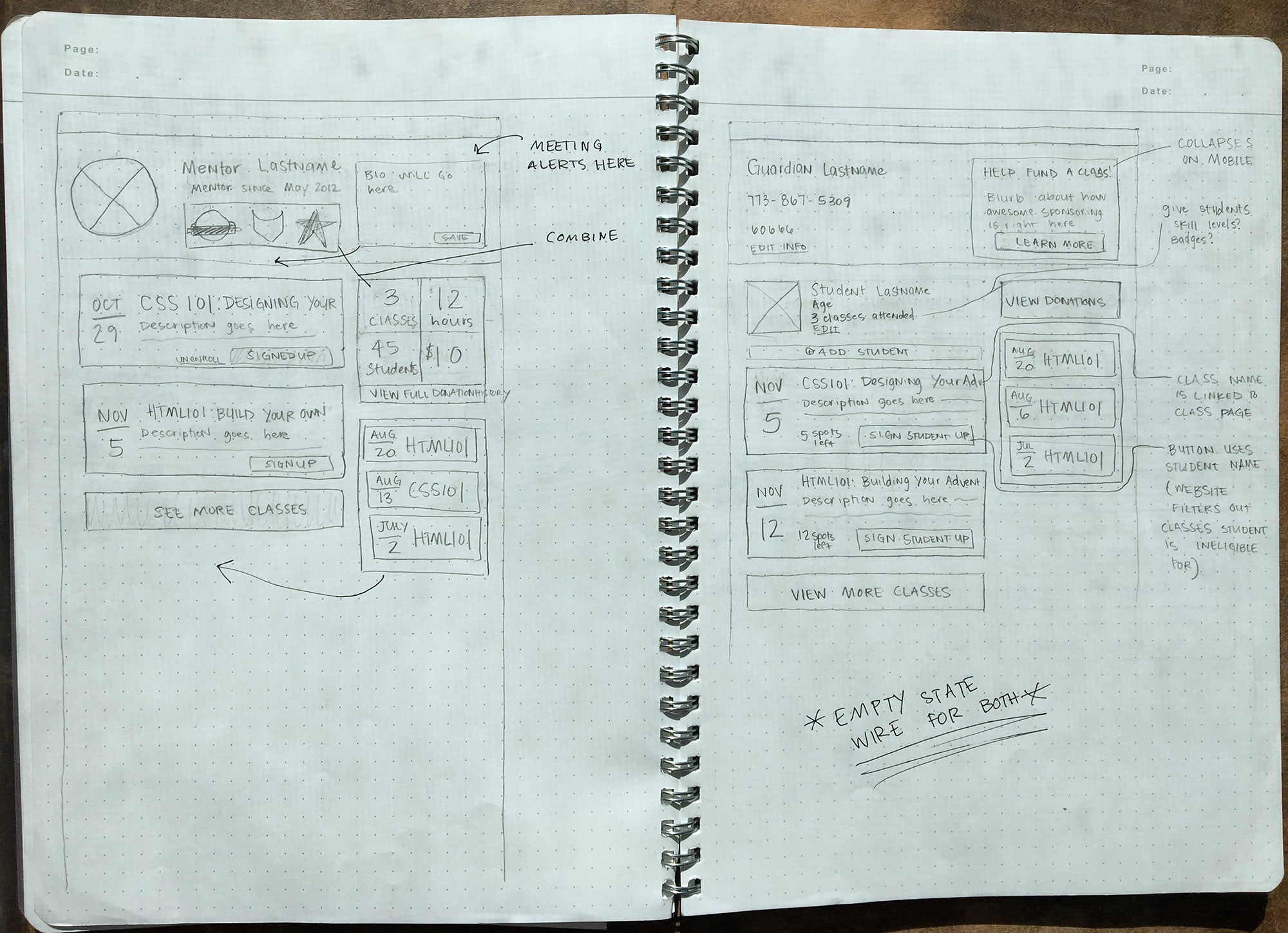
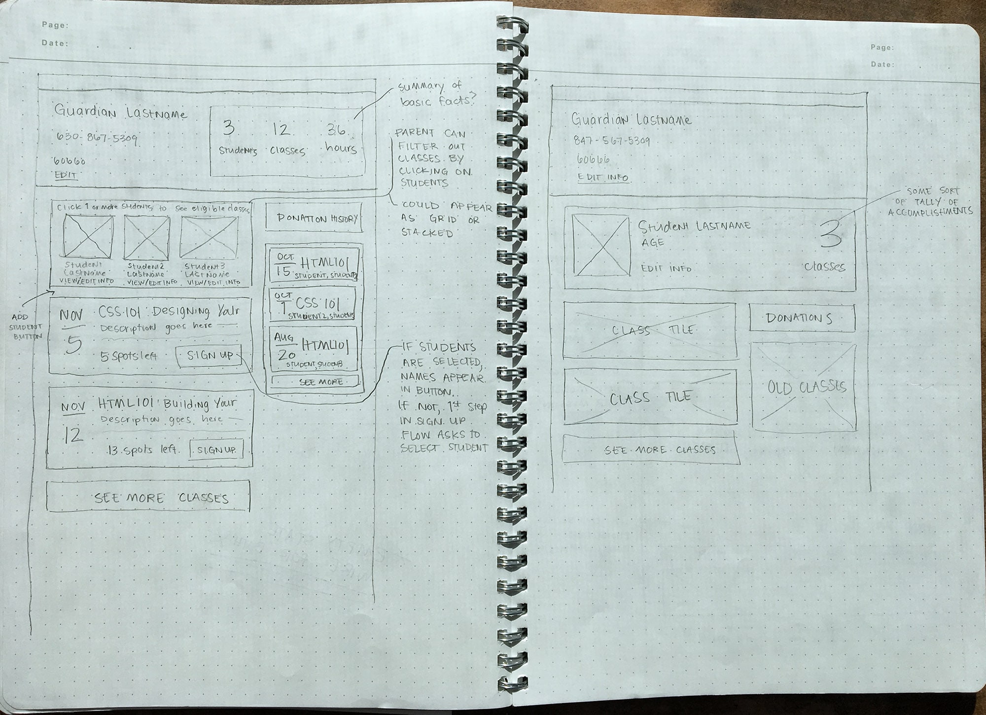
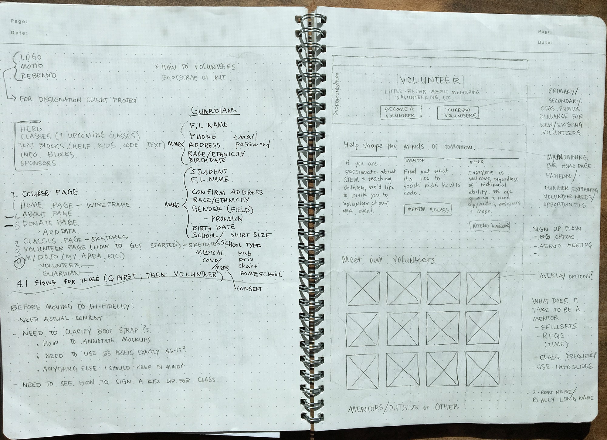
After finishing my research I began fleshing out plans for the new site structure. I created sketches, reviewing my preliminary designs with CoderDojoChi to ensure feasibility and reduce omissions and oversights.
Google Analytics showed a substantial portion of users visited the site on their phones, so I used grid paper to create responsive, modular layouts for each page that would display equally well on desktop and mobile layouts.
Click on an image to enlarge.
wireframes
After discussing my sketches with CoderDojoChi, I incorporated feedback into responsive, medium-fidelity wireframes. Fleshing out my designs in a more precise and realistic context highlighted weaknesses and missteps that were hard to identify in sketches, and allowed for unlimited additional rounds of review and edits before moving to high-fidelity mockups that would require more time and effort to adjust.
Home Page

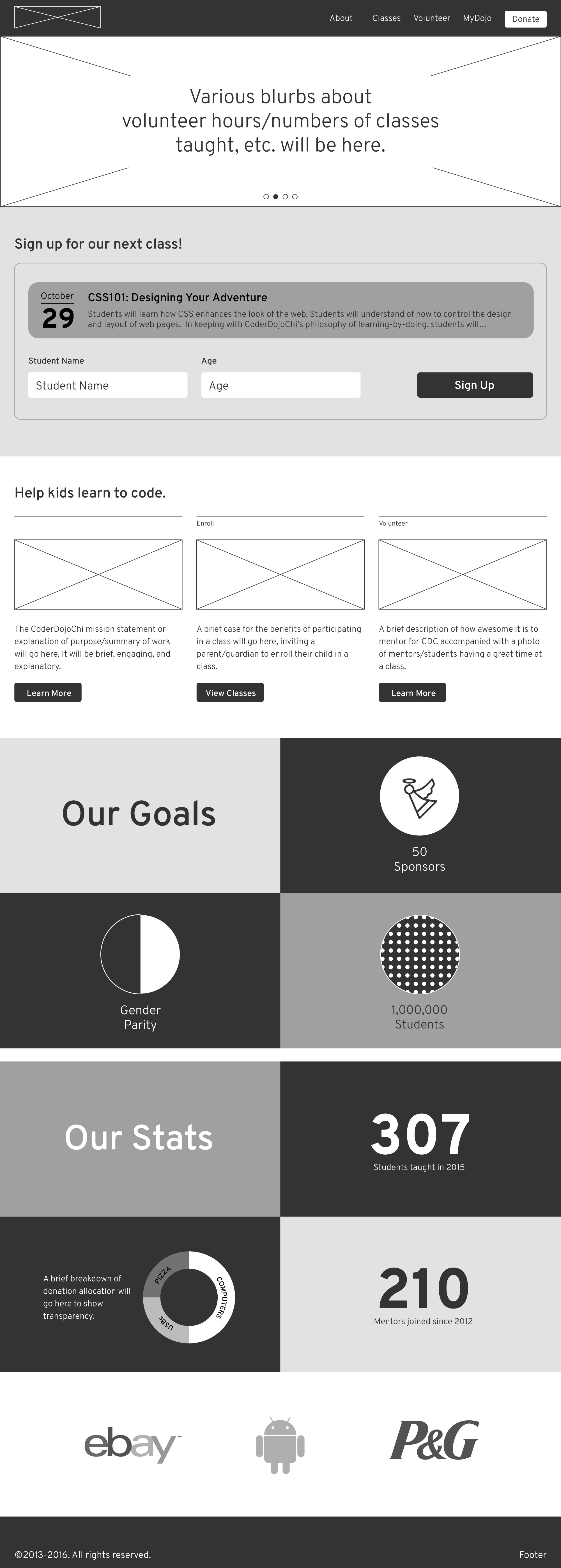
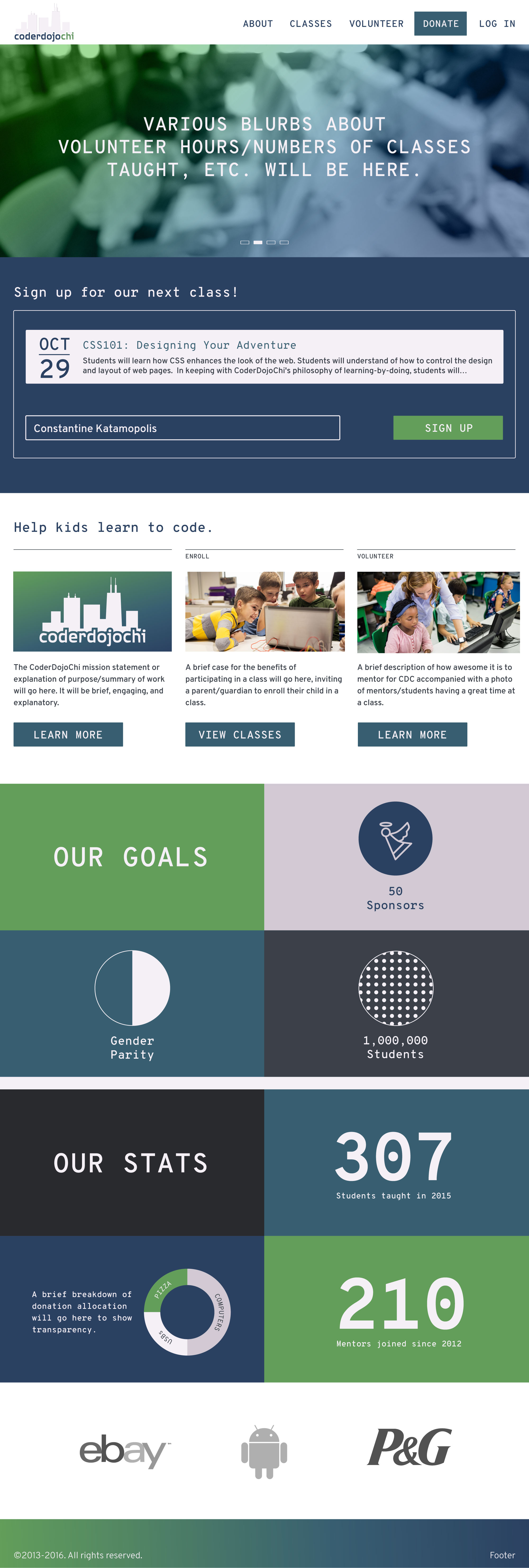
CoderDojoChi’s main purpose is teaching children web development skills, therefore, class attendance is one of their most important metrics. The new homepage design features a prominent invitation to sign up for the closest open class. Users can start the sign up process directly on the landing page, or they can click on the class name for more information before signing up.
Secondary calls-to-action fall below the invitation to sign up for a class — readily accessible and clearly labelled so anyone visiting the site can avoid clicking around aimlessly to find the information they are looking for.
CoderDojoChi’s most relevant stats are displayed prominently, emphasizing transparency and highlighting their achievements. People can see donation allocation and real impact (number of students taught), and they can also learn CoderDojoChi’s core goals in a visually concise manner.
Sponsor logos are are displayed prominently to reinforce credibility.*
*Logos shown in wireframes do not represent real sponsors.
Mentor Page

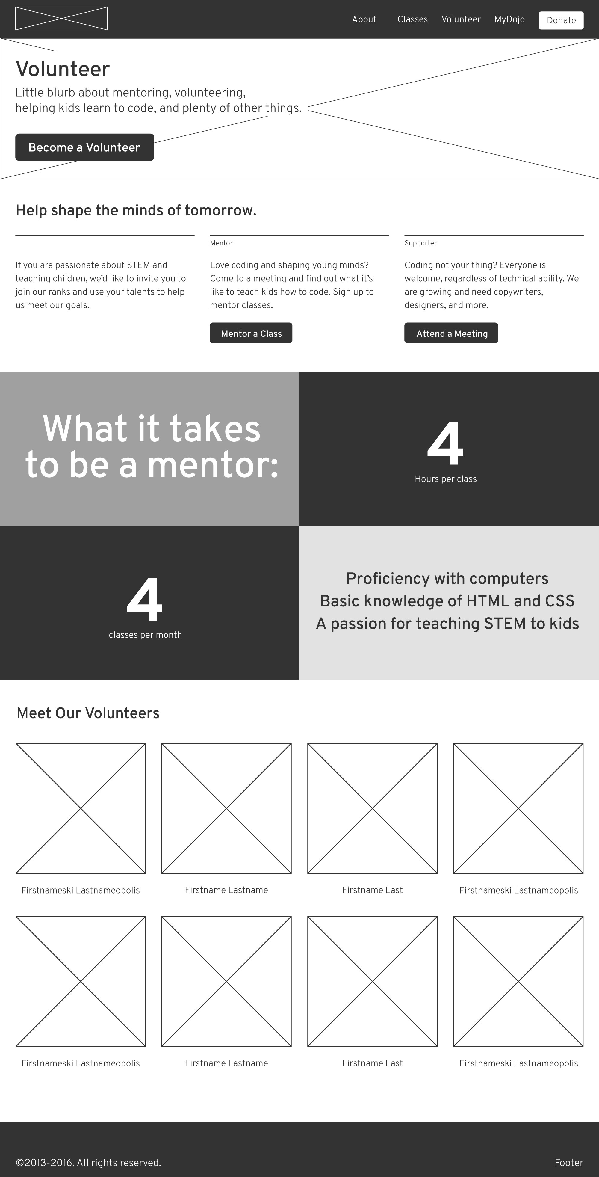
CoderDojoChi’s existing volunteer page gives a brief invitation to attend a meeting and mentor a class, and then displays images of all mentors who have submitted a photo for their profile. While the volunteer page should certainly extend an invitation to visitors, it should also provide other key information, like what volunteer work for the organization will entail, and what real impact volunteers make in the communities they serve.
I used the hero space to invite anyone interested in volunteering in any way to begin the sign up process. Below the hero, I broke up that invitation to volunteer by separately addressing those interested in mentoring classes, and those who are interested in volunteering in other ways (grant writing, course development, design work, etc.). People who want to get involved but don’t feel comfortable interacting with children, or don’t feel suited to teaching web development to others, should know that they can contribute in other ways, and are just as welcome and necessary to the operation as mentors.
The requirements of mentoring are prominently displayed, so anyone unsure how they can best make their contribution can discover if mentoring is for them.
Additionally, as the type of volunteer most crucial to CoderDojoChi’s operation, mentors should be highlighted as a key asset. Thumbnails of participating mentors remain on the page, paying homage to their importance.
Class Information Page

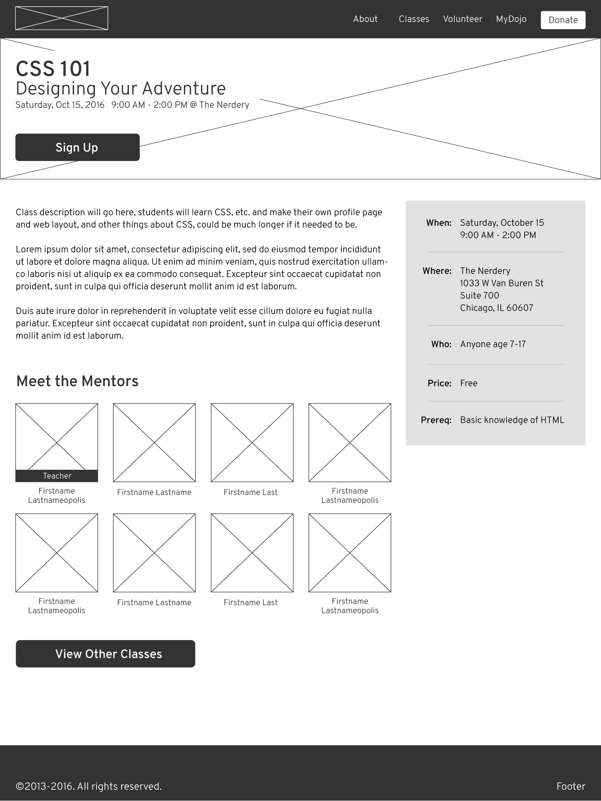
The class description page should be equally useful to mentors and guardians alike. Information like date and time, location, and attendance requirements are highlighted easy to locate. Thumbnail images of mentors who have signed up to teach that class are visible so guardians can see who will be instructing their kids, and potential mentors can see who they will be working with. A brief description of the class material is available, and a link to view other classes aims to prevent drop off of those uninterested in that specific class.
Guardian Dashboard
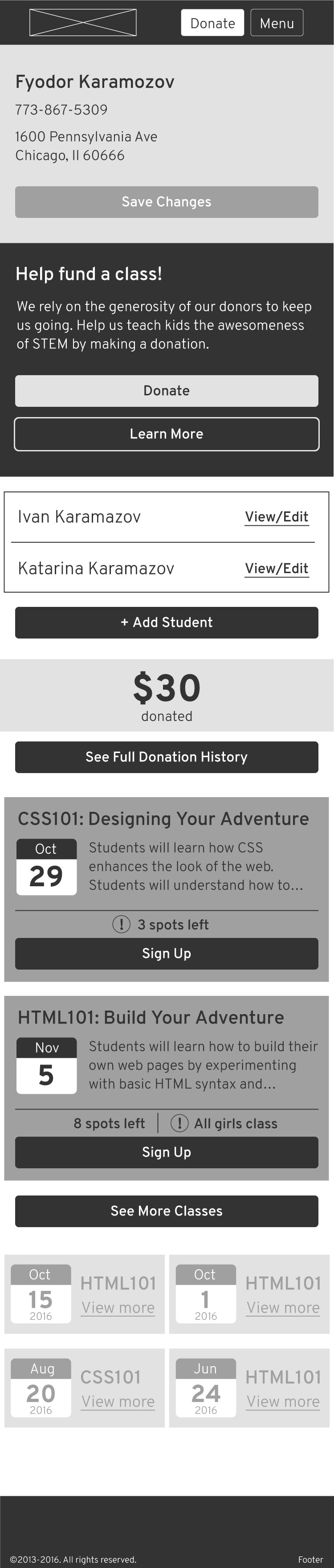
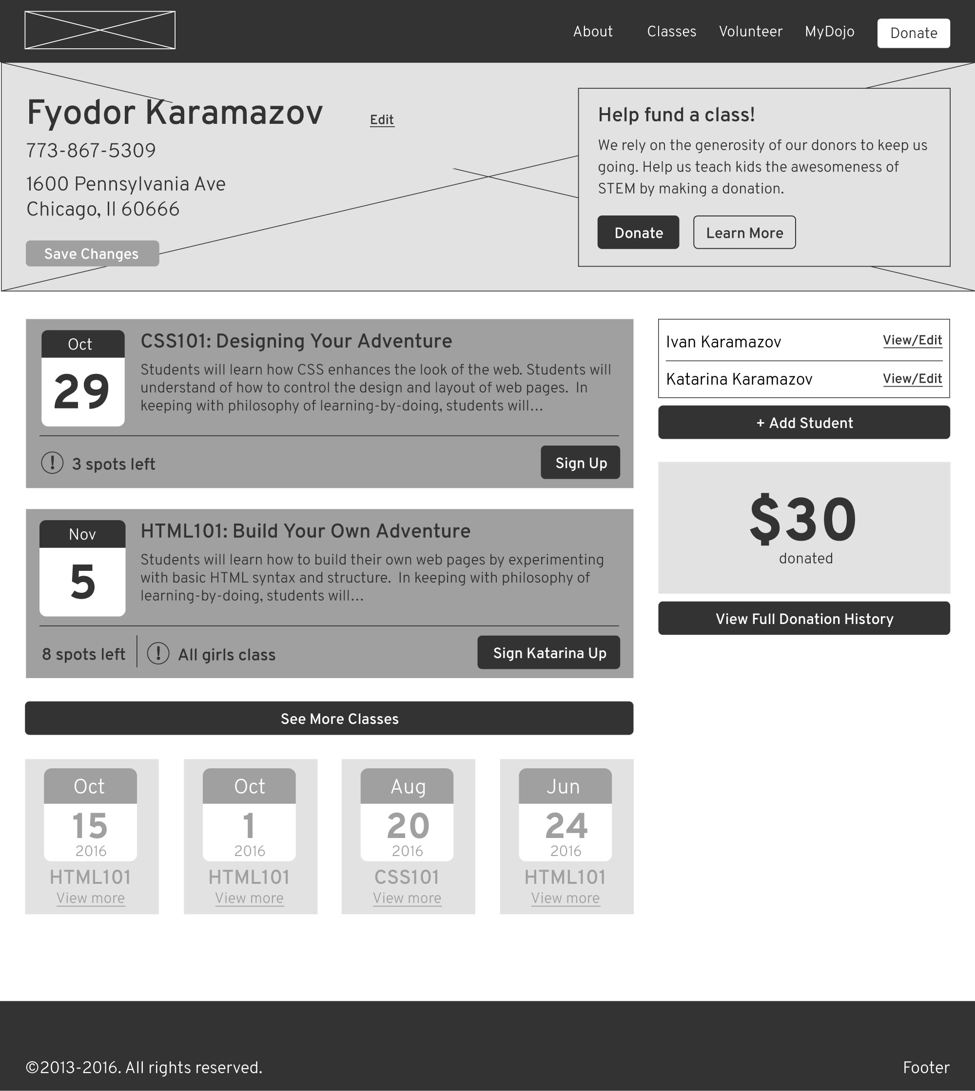
The dashboard pages for both mentors and guardians are meant to be a hub for all the information vital to each group of users. Upcoming classes appear as small tiles, and a user can sign up for a class directly from their dashboard. Personal information can be updated, and certain actions are encouraged by displaying relevant metrics (donations and classes attended for guardians, classes taught and ‘badges’ earned for mentors). Calls-to-action are tailored to the separate groups, inviting guardians to make donations and mentors to attend meetings.
Mentor Dashboard
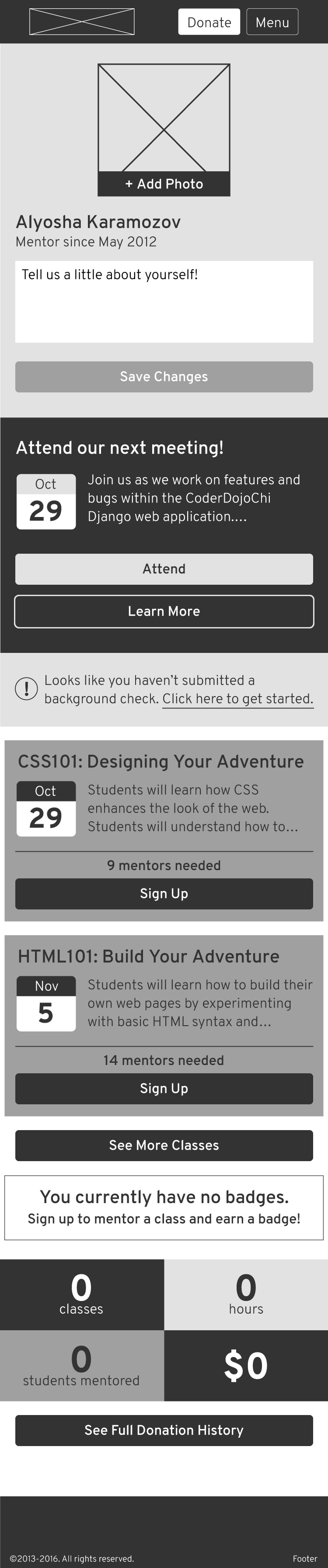
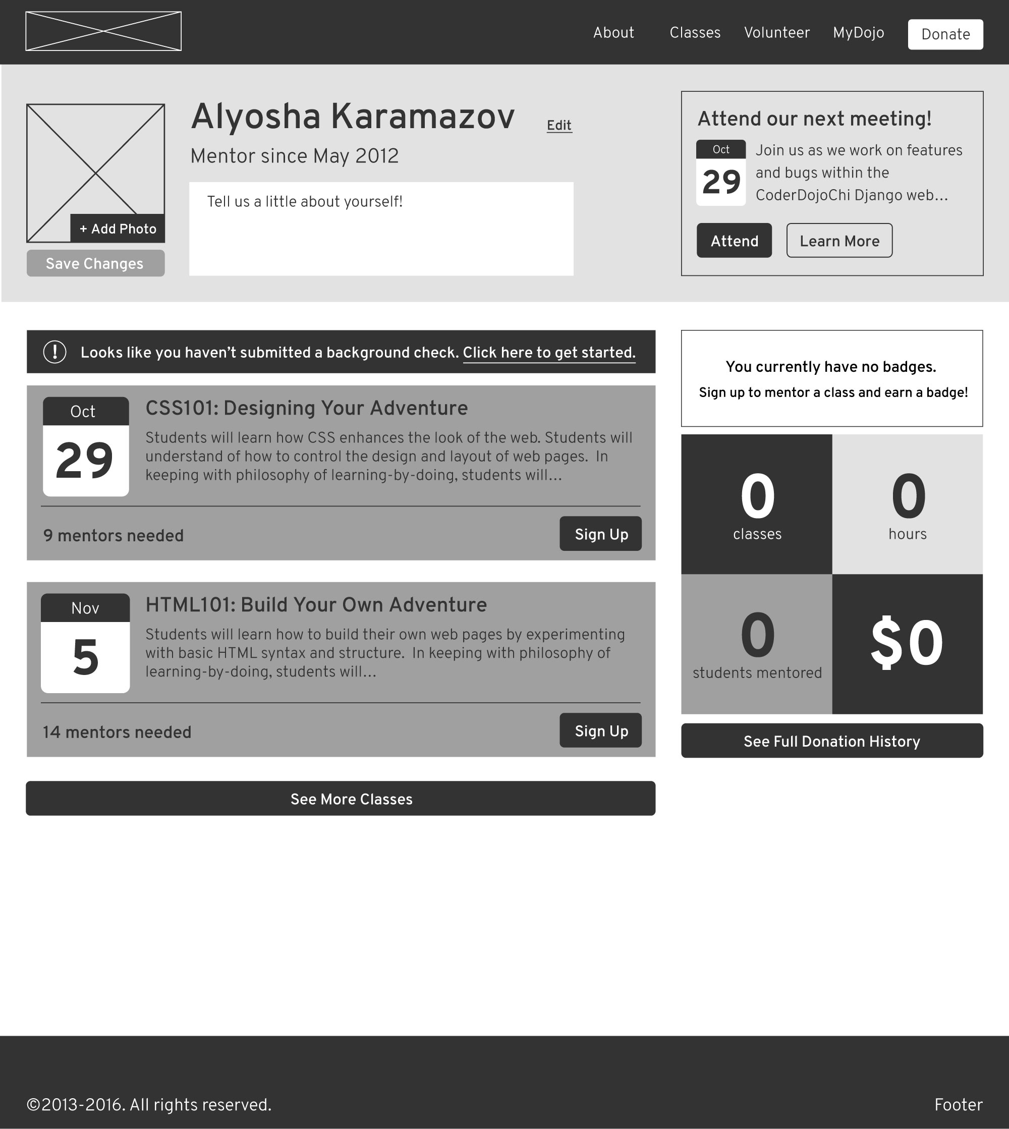
I created empty states for all areas of the dashboard that require user input or action.
to be continued…
The ux redesign work is ongoing — much of the new design depends on content that hasn’t been created yet, and additional components like sign-up and donation forms need to be redesigned as well in order to fulfill our established goals.
rebranding
CoderDojoChi was also interested in updating their branding. I updated their logo, color scheme, and fonts to better align with their brand attributes. I started with the logo redesign.
the logo
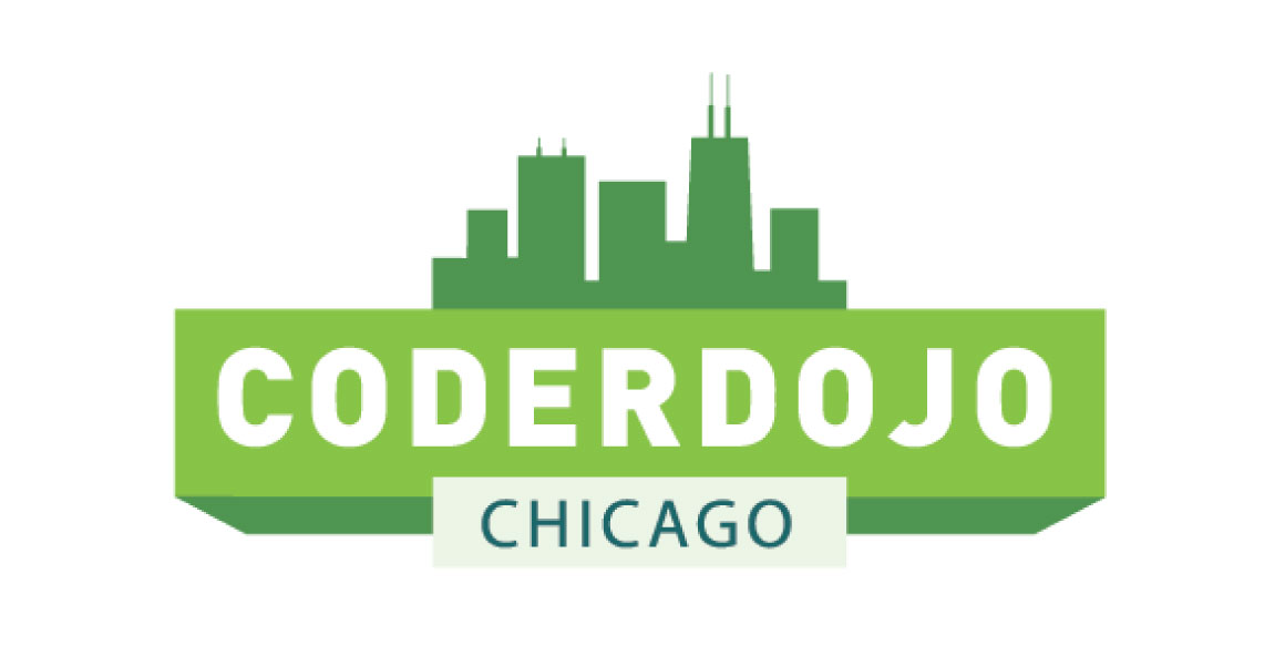
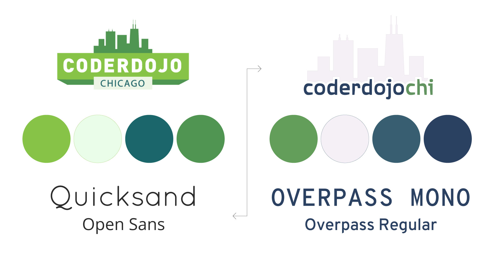
The existing logo uses the Chicago skyline, which serves to emphasize the fact that CoderDojoChi is focused on local impact. The solid boxes add unnecessary weight to the logo, and the text (CoderDojo Chicago) does not reflect how the founder and participants refer to the organization in speech or text (CoderDojoChi).
I created several options for new logos for CoderDojoChi. I simplified the text to reflect how members of the CoderDojoChi organization actually refer to it, and experimented with strong, unique fonts. I also wanted to maintain a subtle nod to Chicago, whether highlighting the ‘Chi’ in the logotype, or incorporating a star from the Chicago flag.
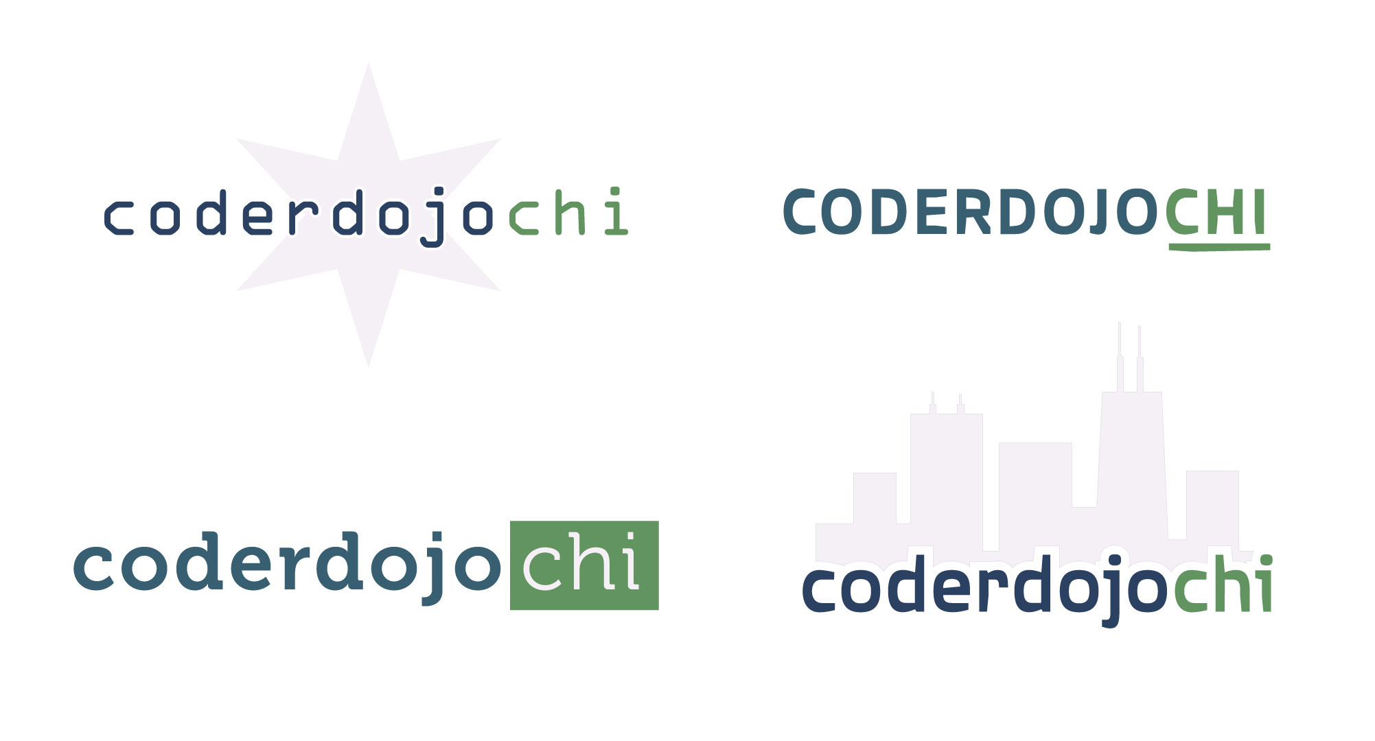
CoderDojoChi has a substantial amout of existing members and participating children and guardians. I chose the logo option closest to their original logo form to honor their original logo and take advantage of the brand recognition they’ve achieved so far.

finding a style
After choosing a new logomark, I updated the brand colors to create a more sophisticated palette, and chose new fonts that paired more readily than the existing website fonts, and added a distinct tech vibe to the overall aesthetic of the website.
Overall, I wanted to create a more adult aesthetic for the website. The organization’s purpose revolves around children, but the target audience for the website is parents, guardians, potential mentors and donors, and — possibly — kids in their teens. The color palette remains vibrant enough to suggest youth, creativity, and fun, but the general look and feel of the site remains targeted at adults.
mockups
I applied the new style to the home page wireframes to test how my chosen elements interacted in their intended context.

results
CoderDojoChi presented me with the most complex and demanding ux work I’ve done so far. Not only does this website have a substantial number of unique pages, but several of those pages contain large amounts of information that needs to be organized and prioritized so users can find what they are looking for quickly and easily.
The rebranding was a good excercise in evaluating existing elements to determine what should be preserved, what should be tweaked, and what should be totally overhauled. Nonprofit organizations put significant effort into establishing their brands and gaining recognition and credibility, and any rebrand should honor that effort and work to preserve their hard-earned gains.
This design required extensive attention to detail, and challenged and strengthened my problem solving abilities and critical thinking. Because I was the sole designer, with limited time and a non-existent budget, I had to stretch my creativity and resourcefulness to create high quality, professional designs.